Almost every popup that embarrasses a brand was published by someone in a hurry. The discount code that was never created. The campaign that covered checkout for a week. The signup popup still greeting people who subscribed in March.
This is the checklist that catches all of it — 26 checks across five groups, in the order you should run them. The whole thing takes about fifteen minutes, and it is the cheapest fifteen minutes in conversion optimisation.
Key Takeaways
- Run the checks in order — offer, then design, then rules, then data, then measurement. Each group depends on the one before it.
- Three checks catch most disasters: the checkout exclusion, the conversion gate, and submitting it yourself on a phone.
- Test on a real phone, not a resized window. The keyboard is what breaks popups, and a desktop browser will never show you that.
- Deadlines need a date window, not a calendar reminder for you.
- Write down the number you expect before you publish, or you will accept whatever you get.
Before you start: the 60-second version
If you have one minute and not fifteen, run these six. They catch the failures that actually cost money:
- Is "show again after conversion" off?
- Is there a does not contain
/checkoutpage rule? - Does the discount code exist and work?
- Have you submitted the popup yourself, on a phone?
- Is there exactly one required field?
- If it has a deadline, is there a date window that ends it?
The full list follows. Everything in it exists because someone shipped without it.
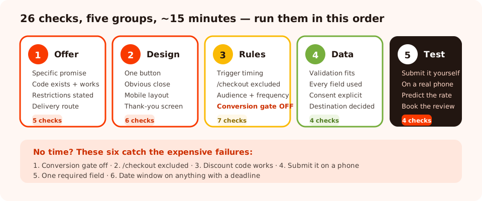
Five groups, 26 checks, roughly fifteen minutes. Run them in this order — each group assumes the one before it passed.
Group 1 — The offer (5 checks)
1. The offer is specific
"Join our newsletter" is a request for a favour. "10% off your first order" or "the one-page sizing guide" is an offer. If your popup does not name what the visitor gets, nothing further down this list will save it.
2. The reward actually exists
The discount code is created in your store, is active, has the right value, and has not expired. Type it into your own checkout before you publish. This is the single most common embarrassing failure in popup marketing.
3. The code's restrictions match the promise
If the popup says "10% off" and the code excludes sale items, has a minimum spend or is single-use per customer, say so in one small line. Discovering a restriction at checkout costs you the order and the trust.
4. The delivery route is real
Decide before launch how the reward reaches them: shown on the thank-you screen, sent by your email tool, or both. "Both" is the right answer — the on-screen code is instant, the email is the one they can find again.
5. The ask is proportionate
One email for a discount is fair. Five fields for a newsletter is not. If the ask is bigger than the offer, fix the offer rather than the copy.
Group 2 — The design (6 checks)
6. One primary button
Exactly one thing styled as a button. Everything else is a text link or deleted. Two buttons is two decisions, and the reliable outcome of two decisions is neither.
7. The close control is obvious
Real contrast, visible immediately or within a second or two, plus dismissal by clicking the surrounding overlay. A hard-to-close mobile interstitial is a search-ranking risk as well as an irritation.
8. There is a visible decline option
"No thanks, I'll pay full price" converts a dismissal into a decision. It also makes the popup feel confident rather than desperate.
9. It reads at a glance
Headline, one supporting line, one field, one button. If it takes more than three seconds to understand, it will be closed before it is understood.
10. The mobile layout is its own layout
Not a scaled-down desktop card. Fewer words, bigger tap targets, and the button reachable without scrolling inside the popup.
11. The thank-you screen does three jobs
Confirms it worked, delivers the reward on screen, and offers one next step. Then closes itself after a few seconds so it is not in the way.

Most design checks are subtraction. If you are unsure whether an element earns its place, it does not.
Group 3 — The display rules (7 checks)
12. The trigger gives the page a chance
Scroll depth around 50–60% on articles, 20–30 seconds or exit intent on product pages. Anything under about eight seconds arrives before the visitor has formed an opinion.
13. Mobile has a trigger that can actually fire
Exit intent needs a cursor. If it is your only trigger, half your traffic never sees the campaign — add a scroll or inactivity trigger.
14. Only one or two triggers are on
Triggers are an OR: the popup fires on whichever hits first. Switching them all on is functionally identical to "show immediately".
15. Page targeting is set, including exclusions
One contains rule for where the offer belongs, and a does not contain rule for
/checkout. Add /cart and /account unless there is a reason not to.
16. The audience is right
New visitors for welcome offers, returning visitors for second asks, everyone for announcements. Remember that recognition comes from browser storage, so a loyal customer on a new phone will look new — make sure the copy survives that.
17. Frequency is not "every visit"
Once a day for a capture popup, once every 7–14 days for a follow-up. "Every session" belongs only to genuinely time-limited announcements.
18. "Show again after conversion" is off
The most important switch on the page. Off means subscribers stop seeing the signup popup. It is per campaign — it suppresses that popup for people who submitted that popup.
If the campaign has an end date, use a date window. A sale popup that runs three days past the sale is a support ticket generator. Set the window so the campaign switches itself off, in the right time zone, without you being awake for it.
Group 4 — The data (4 checks)
19. Validation matches the audience
Format checking plus a typo guard for consumer signups. Business-email restriction only on genuinely B2B forms — switch it on for a consumer store and you silently reject every personal address while clicks look perfectly healthy.
20. Every field is one you will use
For each field, name the email, segment or action that changes because of the answer. If you cannot, delete the field. Required fields that nobody wants to answer produce junk, not data.
21. Consent is handled properly
If you are adding people to a marketing list, the consent is explicit, the checkbox is unticked by default, and it is clear what they are signing up for. Our GDPR-compliant popups guide covers the detail — including the fact that a pre-ticked box is not consent.
22. You know where the data goes
Submissions are stored per campaign in the dashboard. Decide now — before you have 400 rows — how they reach your email tool and who is responsible for moving them.
Group 5 — Test and measurement (4 checks)
23. You have submitted it yourself, on a real phone
Not a resized desktop window. A real phone, on the live site, all the way through to the thank-you screen and the email that follows. This one check catches broken codes, hidden buttons, validation traps and missing confirmations in about ninety seconds.
24. It does not collide with another campaign
Check what else is targeted at the same pages and moments. Two popups in one page view reads as an interrogation and both of them lose.
25. You have written down the number you expect
Before publishing, write your prediction: "I expect roughly X% of views to convert." Without it you will accept whatever number appears and call it fine.
26. A review date is in your calendar
Two weeks out. Open it, compare against the prediction, change one thing. Campaigns that nobody ever reviews are how a popup ends up advertising a sale that finished in March.

Views prove the rules fire. Everything after views tells you whether the popup deserves to.
Ship your next popup with confidence
Design, targeting, validation, thank-you screens and analytics — in one no-code editor. Free plan, no credit card required. Paid plans from $29/month.
Start free →The checklist as a table
Copy this into your project tool and tick it off per campaign.
| # | Check | Group | Catches |
|---|---|---|---|
| 1 | The offer is specific | Offer | Low click rate |
| 2 | The discount code exists and works | Offer | Public embarrassment |
| 3 | Restrictions are stated up front | Offer | Abandoned checkouts |
| 4 | Delivery route decided (screen + email) | Offer | "Where's my code?" tickets |
| 5 | The ask is proportionate to the offer | Offer | Low submission rate |
| 6 | One primary button | Design | Split attention |
| 7 | Close control is obvious | Design | Complaints, mobile SEO risk |
| 8 | Visible decline option | Design | Reflexive dismissal |
| 9 | Readable in three seconds | Design | Fast closes |
| 10 | Mobile layout designed separately | Design | Half your traffic |
| 11 | Thank-you screen delivers + next step | Design | Wasted peak moment |
| 12 | Trigger gives the page a chance | Rules | Reflexive dismissal |
| 13 | Mobile has a trigger that can fire | Rules | Zero mobile views |
| 14 | Only one or two triggers enabled | Rules | Accidental instant popup |
| 15 | Page rules set, /checkout excluded | Rules | Lost orders |
| 16 | Audience matches the message | Rules | Wrong-person copy |
| 17 | Frequency is not "every visit" | Rules | Fatigue and complaints |
| 18 | "Show again after conversion" is off | Rules | Asking subscribers to subscribe |
| 19 | Validation matches the audience | Data | Silent rejections |
| 20 | Every field has a named use | Data | Friction and junk data |
| 21 | Consent explicit and unticked | Data | Compliance exposure |
| 22 | Data destination decided | Data | Leads nobody contacts |
| 23 | Submitted by you, on a real phone | Test | Almost everything |
| 24 | No collision with another campaign | Test | Double interruption |
| 25 | Expected conversion rate written down | Measure | Accepting bad results |
| 26 | Review date in the calendar | Measure | Zombie campaigns |
What to do at the review date
Two weeks after launch, open the campaign and read the funnel top-down. The shape tells you which check you skipped:
- Almost no views → a rule is blocking. Check 15, 16 and 17, plus any date window.
- Views but no clicks → the offer or the moment. Checks 1, 5 and 12.
- Clicks but no submissions → the form. Checks 19 and 20.
- Everything healthy → leave it alone and go and build the next campaign.
Then change one thing, and only one. The full diagnostic routine is in our popup analytics guide, and the thirteen failures this checklist is designed to prevent are catalogued in popup mistakes that kill conversions.
Related reading
Frequently asked questions
What should I check before publishing a popup?
Run five groups in order: the offer (is it specific, does the code work, is the ask proportionate), the design (one button, obvious close, mobile layout, thank-you screen), the display rules (trigger, page exclusions, audience, frequency, conversion gate), the data (validation, field use, consent, destination) and measurement (submit it yourself on a phone, write down the expected rate, book a review date).
What is the single most important popup pre-launch check?
Submitting the popup yourself, on a real phone, all the way through to the thank-you screen and the email that follows. It takes about ninety seconds and catches broken discount codes, hidden buttons, validation traps and missing confirmations in one pass — failures that each look fine in the editor.
How do I stop a popup from showing on the checkout page?
Add a page-targeting rule with the 'does not contain' operator and the value /checkout. Make it a habit on every campaign, and add /cart and /account too unless the campaign is specifically a cart-recovery offer. A popup covering a payment step costs orders far more often than it earns emails.
How do I make a seasonal popup switch itself off?
Use the date-window rule rather than a calendar reminder for yourself. Set a start and end date with hours in the right time zone, and the campaign stops serving the moment the offer expires — including at 11pm on a Saturday when nobody is going to log in and disable it.
How long after launching a popup should I review it?
Two weeks, booked in the calendar before you publish. Compare what happened against the conversion rate you predicted, then change exactly one thing. Reviewing sooner tempts you to react to noise, and never reviewing is how a campaign ends up advertising a sale that finished months ago.
Why does my popup get clicks but almost no submissions?
That is a form problem, not an offer problem. The two usual causes are too many fields — every field is a decision, not a keystroke — and a validation rule silently rejecting people, most often business-email validation left on for a consumer audience so every personal address bounces without an obvious error.