A lightbox popup is a card in the centre of the screen with the page dimmed behind it. That is the whole definition — and the dimming is the important half, because it is what removes every competing element and leaves the visitor with two choices: engage, or close.
Used well, that focus is why the format converts. Used badly, it is why people talk about popups the way they talk about cold calls. The difference is not the design; it is whether the moment deserved the whole screen.
Key Takeaways
- Lightbox = centred card + dimmed backdrop. The dim is the format; without it you have a dialog.
- It is the loudest format you own. Spend it on offers, games and quizzes — not on announcements.
- Background-click dismissal should stay on in everything except a deliberately gated flow.
- A reveal delay on the close button is a trust decision — small numbers feel considered, large ones feel like a trap.
- On mobile, check the close control before anything else. Unreachable X, guaranteed bounce.
What is a lightbox popup?
Lightbox popup, in two sentences
A lightbox popup is an overlay that places a bounded card in the middle of the viewport and darkens the rest of the page behind it with a semi-transparent layer. It takes visual focus completely, which makes it the strongest format for a single decision and the wrong one for anything ambient.
The name comes from photography — a lightbox is where you put a slide to look at it with nothing else in view. The web borrowed it for image galleries first, then for every kind of overlay. In a popup builder it is simply the combination of a centre position and a visible overlay: change the position to a corner and the same card becomes a slide-in; drop the overlay to zero and it becomes a floating dialog.
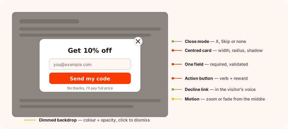
Seven decisions. Only two of them are about the content of the card.
Lightbox vs the other popup formats
Format is a choice about how much of the visitor's attention you are willing to take. Here is the honest comparison.
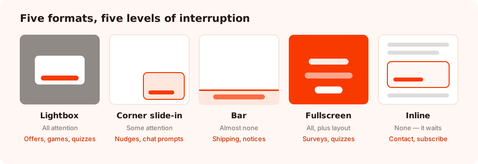
Same content, five levels of interruption. Pick the smallest one that can do the job.
| Format | How it appears | Attention taken | Best for | Main risk |
|---|---|---|---|---|
| Lightbox | Centred card, page dimmed | All of it | Offers, prize games, quizzes, exit rescues | Feels intrusive if it fires on arrival |
| Corner slide-in | Anchored to a corner, no dim | Some | Announcements, returning-visitor nudges, chat prompts | Easy to ignore completely |
| Top or bottom bar | Full-width strip at an edge | Very little | Shipping thresholds, sale notices, consent lines | Not enough room for a real offer |
| Fullscreen | Edge-to-edge page | All of it, plus the layout | Multi-step surveys and quizzes, welcome mats | Feels like a wall on mobile |
| Inline block | Sits in the page content | None — it waits | Contact forms, subscribe blocks in articles | Only converts people who scroll to it |
In ChilliPopup those are not five different products. A popup is anchored with one of nine positions — centre, the four corners, or centred on any edge — and each anchor picks up the entry and exit motion that suits it: an edge-anchored card slides in from its own edge, a centred one zooms out of the middle. Surveys and quizzes additionally offer a fullscreen presentation instead of the bounded card, and forms cover the inline case.
Eight lightbox popup examples
1. The first-order discount
The archetype. "Get 10% off your first order", one email field, one button, one decline link. It earns a lightbox because the trade is worth a full stop — but only on exit intent or after a scroll signal, never on arrival.
2. The prize game
A spin wheel, scratch card, slot machine or claw machine is a lightbox by nature: it needs the middle of the screen and a moment of undivided attention. The play happens, then the claim screen collects the email and reveals the prize. Optionally a short teaser screen runs before the game to explain the rules.
3. The finder quiz
Three tappable questions that end in a recommendation. A lightbox works here because each question needs to be the only thing on screen; a corner card cannot hold a sequence without feeling cramped.
4. The exit-intent cart rescue
On the cart page, when the cursor heads for the tab bar: one offer that removes friction — free shipping, returns reassurance, a saved basket. The dim is doing real work here, because it interrupts a departure.
5. The video lightbox
The format's original job. A YouTube block inside a centred card, opened by a click on your own page rather than by a timer, so the video never autoplays into someone's afternoon. Details in the video popup guide.
6. The announcement that actually matters
Not "we have a blog" — a shipping cut-off, a service change, a launch date. If it does not change what the visitor does in the next five minutes, it belongs in a bar, not a lightbox.
7. The feedback ask, after the fact
A one-question survey — a star rating, a thumbs up/down, an NPS scale — on the order-confirmation page. Short enough that the interruption is a fair trade for the answer.
8. The gate you actually need
Age verification, region confirmation, a legal acknowledgement. This is the one case where blocking the page is the entire point: the content gate keeps the popup up until the visitor completes it, and background-click dismissal is disabled while it is on. Use it for compliance, never for marketing.
Gating content behind a lightbox is a strategy with a cost. A visitor who cannot read anything without submitting an email will mostly leave, and a page that hides its content on arrival is exactly the pattern search engines treat as an intrusive interstitial. Gate compliance, not curiosity.
The settings that decide how a lightbox feels
Two lightboxes with identical copy can feel completely different. These are the controls that do it.
The backdrop
Overlay colour and opacity are separate settings. A dark overlay at roughly half opacity is the safe default: the card lifts, the page stays recognisable. Push it towards opaque and the site looks broken; drop it near zero and the card floats on visual noise, which is the most common reason a well-designed popup reads as cheap.
The close control
Three modes: an X in the corner, a text Skip link, or no close control at all — the last only defensible with auto-close or a genuine gate. The X supports three further options, and each one is a trust decision:
- Reveal delay — how many seconds before the X appears. Zero is honest. A few seconds is common. Ten seconds is a trap, and people remember traps.
- Hover message — a short confirmation shown when the cursor reaches the X. Useful for one last sentence; obnoxious if it guilt-trips.
- Spin on hover — a small motion cue that the X is interactive. Harmless fun.
Alongside those: background-click dismissal (leave it on), auto-close after N seconds (good for announcements, bad for offers), and the content gate that keeps the popup up until the form is completed.
The card itself
Width and height in pixels, a corner radius, one of four shadow presets, a background colour or a two-stop gradient, and an optional background image. The combination that reads as "modern lightbox" is a generous radius, a soft shadow, real padding around the content, and a card no wider than it needs to be — a 900px card on a 1440px screen is not a lightbox, it is a wall.
The motion
Entry effects include slide-in from any edge, bounce in, zoom from the middle, fade and flip, plus attention effects — tada, pulse, flicker, heartbeat, shake — that can be used on entry or exit. Exit effects mirror them. One rule: for a centred lightbox, pick a middle or fade entry. A card that slides in from the left and then sits in the centre looks like a bug.
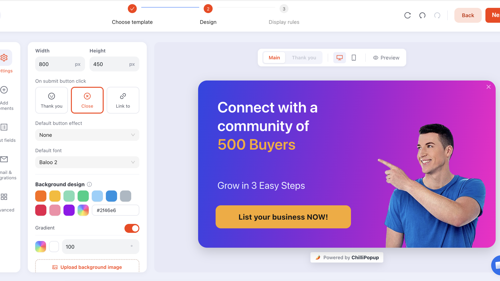
Position, overlay, animation and close options all live in the editor — no CSS required.
When a lightbox is the wrong choice
- On arrival, on mobile. The pattern most likely to be judged intrusive by visitors and search engines alike. Use a delay, a scroll trigger, or a bar instead.
- For anything ambient. Free-shipping reminders, cookie notices, "we're hiring" — a bar or a corner card does that job without stopping the visit.
- During checkout. Never interrupt a payment flow with a centred card. If you must speak, speak at the edge.
- When you have two things to say. A lightbox holds one decision. Two offers in a centred card converts worse than either offer alone.
- On small screens with long content. A five-field form in a centred card on a phone is a scrolling trap. Switch to fullscreen, or cut the form.
Mobile and accessibility checklist
- The close control is reachable with a thumb and not hidden under a sticky header.
- Text is readable without zoom — 16px minimum for body copy, more for the headline.
- The card fits the viewport with the keyboard open, not just with it closed.
- Contrast holds between text and the card background, and between the card and the dimmed page.
- Nothing essential is covered — check add-to-cart and navigation on a real device.
- Motion is short. A long animation on a slow phone reads as jank, not polish.
- Background-click dismissal works, because that is what people try first.
The one-second test. Open the page on a phone, let the popup fire, and count how long it takes you to work out what is being offered and how to leave. If either answer takes more than a second, the design is not finished.
Five mistakes that make a lightbox feel aggressive
- A long reveal delay on the X. Every second past two or three costs you goodwill you cannot buy back.
- Disabling background-click dismissal on a marketing offer. It is the difference between a card and a cage.
- A near-opaque backdrop. The site disappears; the visitor assumes something broke.
- Repeating on every page view. Set a frequency, and turn off "show again after conversion" so the people who already said yes stop being asked.
- Guilt-trip decline copy. "No thanks, I hate saving money" wins nothing and is remembered for a long time. Write the decline in the visitor's own voice.
Build a lightbox popup
Start from a template in the popup builder, set the position to centre, and work through four settings: overlay colour and opacity, close mode and its options, entry and exit motion, and card size and radius. Then rule it — a trigger that is not "on load", a page target, a frequency, and "show again after conversion" turned off.
If the pixel is not on your site yet, the one-line install guide takes a couple of minutes, and the same script serves every format you build afterwards — lightbox, bar, slide-in, fullscreen survey or inline form.
Design your lightbox in the editor
Position, backdrop, animation and close behaviour are all settings, not code. Free plan, no credit card required. Paid plans from $29/month.
Start free →Related reading
Frequently asked questions
What is a lightbox popup?
A lightbox popup is a card that appears in the centre of the screen while the rest of the page is dimmed behind a semi-transparent overlay. The dimming is what makes it a lightbox rather than a plain modal: it removes every competing element so the card is the only thing left to read or dismiss.
What is the difference between a lightbox popup and a modal?
In practice they are the same object described from two angles. "Modal" describes the behaviour — it sits above the page and takes focus — while "lightbox" describes the look, a centred card over a dimmed backdrop. A modal without a dimmed overlay is usually called a dialog; a lightbox always dims.
When should I use a lightbox popup instead of a corner slide-in?
Use a lightbox when the message deserves the whole screen: a first-order discount, a prize game, a quiz that decides what the visitor sees next, or an exit-intent rescue on a cart. Use a corner slide-in when the message is helpful but optional — a chat prompt, a small announcement, a returning visitor nudge — because it never blocks what the person came to do.
Do lightbox popups hurt SEO?
Only when they behave like intrusive interstitials: covering the main content immediately on arrival, especially on mobile, with no obvious way out. A lightbox that fires on exit intent, on scroll depth or after a delay, and has a visible close control, sits outside that pattern.
What backdrop opacity should a lightbox popup use?
Enough to lift the card off the page without making the site look broken — a dark overlay somewhere around half opacity is the common default. Very low opacity makes the card feel like it is floating on noise; near-total black feels like an error state and makes the close control harder to find.
Should a lightbox popup close when the visitor clicks the background?
Yes in almost every case. Background-click dismissal is what experienced users try first, and denying it is the fastest way to make a popup feel like a trap. The exception is a deliberately gated flow — an age check, for example — where completing the content is the point.