
Add-to-cart rate is the share of product page views that end with something in the basket, and it's the single most diagnostic number a store has: it isolates the product page from everything else. When it's low, the cause is almost always one of four unanswered questions — what will this really cost me, will it fit, can I trust you, and can I undo it if I'm wrong.
Below: how to measure the gap properly, the eleven fixes that answer those questions in priority order, the one-question survey that tells you which of the four is blocking your shoppers, and how to avoid the discount that lifts the metric while costing you money.
Key Takeaways
- Add-to-cart rate is a product page score. It's the cleanest signal you have, because it can't be blamed on checkout.
- Total cost is the number one blocker. If delivery cost and timing only appear at checkout, you're losing shoppers on every product page.
- Fit uncertainty is second — and it's answered with measurements and honesty, not more photos.
- Ask, don't guess. A one-question exit survey on product pages ranks your four objections in about a week.
- A discount raises the metric and lowers the margin. Fix the objection first; decide about incentives second.
What add-to-cart rate actually measures
Add-to-cart rate, in one line
Add-to-cart rate = add-to-cart events ÷ product page views. It measures one thing only: whether your product page convinced someone to take the first committing step.
Two things make it more useful than overall conversion rate. It isolates a single stage, so a change in it points at a specific cause. And it moves faster, because there are far more add-to-cart events than purchases, so you can read a change in weeks rather than quarters.
Measure it per product, not site-wide. A site-wide average blends a bestseller at 14% with a high-consideration item at 2% and tells you nothing actionable. Rank your top ten products by shoppers lost — views minus add-to-carts — and work down that list.
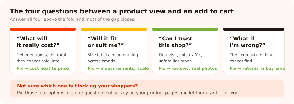
Four questions. If your product page answers all four above the fold, most of the gap closes.
Eleven fixes, in priority order
Cost clarity (fixes the biggest objection)
- Put delivery cost and timing next to the price. "Ships in 1–2 days · Free over €60 · €4.90 otherwise". A shopper who can't calculate the real total will not commit, and they won't tell you why — they'll just leave.
- Show the free-shipping gap on the product page, not only in the cart. "Add €12 more for free delivery" converts a hesitation into a browsing session.
- Be explicit about taxes and duties for international shoppers. Ambiguity here reads as risk.
Fit and suitability
- Give real measurements, not just sizes. Garment dimensions, product dimensions, weight, what's in the box. A size label means nothing across brands; a centimetre does.
- Say how it runs, in one sentence. "Runs small — size up if you're between sizes" is worth more than four extra photos.
- Show it in context and at scale. One photo of the product being used, next to something recognisable, answers the question studio shots can't.
- Add a recommender for wide catalogues. When the blocker is "which one is right for me" rather than "is this one right", a short product recommendation quiz converts far better than another filter — and it collects an email at the end.
Trust and reversibility
- Put the returns window in the buy area. Not the footer, not a policy page. Removing the downside is part of the offer.
- Show review count and rating near the price, with real reviews further down. The count matters as much as the score.
- Answer the top three pre-purchase questions on the page. Take them from your support inbox. They're already ranked by frequency, and they're already written in customer language.
The button itself
- Reduce competition around the add-to-cart button. One primary action, visible without scrolling on mobile, with variant selection immediately above it. Every badge, banner and secondary CTA next to it is a competing decision.
Don't ship all eleven at once. You'll get a number that moved and no idea which change did it — which means you can't repeat it on the rest of the catalogue. One change, two weeks, then the next.
Find out which objection is yours
The eleven fixes above are a menu, not a to-do list. Which ones matter depends on your category and your shoppers, and there's a fast way to find out: ask the people leaving a product page without adding anything.
A one-question survey, page-targeted to URLs containing your product path, triggered on exit intent for desktop and a scroll percentage or inactivity delay for mobile:
"Not adding this one? What's holding you back?"
• The price • Delivery cost or timing • Not sure it'll fit
• Still comparing
What would have helped? (optional)
A hundred and fifty to two hundred responses is enough to rank the four. Two mechanics make this more productive than it looks. Partial responses are recorded — someone who taps an option and closes without submitting still counts, and on an exit survey that's a meaningful share of your data. And the collected-fields breakdown shows the top values per field, so the ranking arrives already counted.
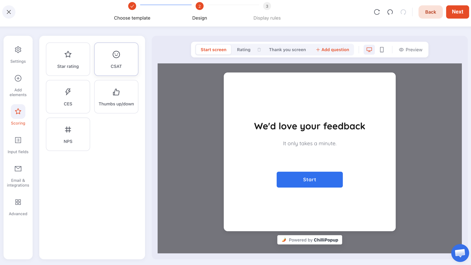
One question. A second question costs you a third of your responses and rarely changes what you do.
A useful pattern to watch for: if "still comparing" wins, your product page probably isn't the problem at all — the shopper is mid-research, and what you need is a way to be remembered, not a better buy button. That's a capture campaign, not a page fix.
The two campaigns worth running on a product page
Product pages are the wrong place for loud interruptions — the shopper is doing exactly what you want them to do. Two campaigns earn their place anyway.
1. Back-in-stock capture on out-of-stock variants
The highest-intent email address you will ever collect, and most stores simply don't ask. An inline form in the buy area — "Sold out in your size. Want an email when it's back?" — turns a dead end into demand data. You learn which variants to reorder and you get a list to email on the day it lands.
2. An exit-intent offer for shoppers who still leave
Once the objection survey has done its job, the same slot can carry an offer for the people who leave anyway. Keep it modest — these shoppers are close, so a small nudge is enough, and a large discount just pays people who were nearly there.
| On a product page | Verdict | Why |
|---|---|---|
| Inline back-in-stock form on sold-out variants | Always | Zero interruption, highest-intent capture on the site |
| Exit-intent objection survey | Yes, for a fortnight | It's research — take it down once you have your answer |
| Exit-intent offer | Yes, kept small | These shoppers are close; a big incentive overpays |
| Popup on arrival | No | You interrupted someone in the middle of deciding to buy |
| Newsletter overlay | No | Wrong page. Ask on the blog or the homepage instead. |
The display rules that keep this contained: page targeting with contains your product path, an audience rule so first-order offers reach new visitors only, a frequency so nobody meets the same campaign twice in an afternoon, and show again after conversion switched off. On mobile, swap exit intent — which is a cursor signal and doesn't exist on phones — for a scroll percentage or the inactivity trigger.
Ask your product pages what they're missing
Exit surveys, back-in-stock forms and recommendation quizzes from one editor — and one pixel. Free plan, no credit card required. Paid plans from $29/month.
Start free →A worked example: a homeware store at 3.4%
The numbers. 5,800 product page views a month, 197 add-to-carts, 3.4%. The best-selling category — rugs — sits at 1.9%, which is where the lost shoppers actually are.
The survey. Exit intent on product URLs, four options, two weeks, 168 responses. "Not sure it'll fit" takes 44%, and the free-text answers are all variations of the same sentence: "I can't tell how big it is."
The fix. Not more photos. Three specific changes: exact dimensions in the buy area in both centimetres and feet; one photo of each rug in a room with recognisable furniture for scale; and a one-line "which size for which room" note under the variant picker.
The check. Metric declared in advance: add-to-cart rate on rug pages over four weeks versus the four weeks before. Downstream check: return rate, because a fit fix should lower returns — if add-to-carts rise and returns rise with them, you didn't fix the problem, you just talked people into a mistake.
The next loop. Second place in the survey was delivery timing, so that's the next change: an estimate on the page instead of at checkout. The survey stays up for one more cycle to confirm the ranking shifted.
Seven mistakes that keep add-to-cart rate flat
- Adding photos when the problem is information. A tenth image doesn't answer "how big is it" — a measurement does.
- Hiding delivery cost until checkout. The single most common cause, and the cheapest to fix.
- Fake scarcity. A counter that resets when you refresh the page destroys trust with precisely the shoppers who were paying close attention.
- A popup on arrival on the product page. You interrupted someone in the act of deciding to buy from you.
- Measuring site-wide instead of per product. The average hides the two products where all the loss is happening.
- Testing with a discount. It moves the metric for a reason that has nothing to do with your page.
- Ignoring the return rate. Add-to-cart rate up and returns up is not an improvement, it's a more expensive way to lose.
What to measure
- Add-to-cart rate per product, for your top ten by traffic — never a site-wide average.
- Shoppers lost, the absolute number, so you work on the products where the money actually is.
- Cart-to-checkout rate, to confirm you fixed the product page rather than pushed the problem one stage downstream.
- Return rate, especially after a fit or sizing change. This is the honesty check.
- Revenue per session, so a discount-driven lift can't disguise itself as a page improvement.
- Campaign numbers. Each survey, form and popup reports its own opens, unique views, clicks, submissions and conversion rate, plus a breakdown of the values collected per field.

Collected fields turns the survey's four options into a ranked list — the objection at the top is your next change.
Raise add-to-cart rate: five steps
Ninety minutes of setup, then four weeks of leaving it alone. If the pixel isn't installed, the one-line install guide takes about five minutes.
1. Measure the gap on your top ten products
Product views versus add-to-carts, per product, last 30 days. Rank by shoppers lost, not by percentage.
2. Put the objection survey on those pages
One question, four options, one optional text box. Page target contains your product path, exit intent plus a scroll or inactivity trigger for mobile, frequency once a day.
3. Answer the winning objection next to the price
In the buy area, in the shopper's words. One change. Note the date you shipped it.
4. Add the recovery layer
An inline back-in-stock form on sold-out variants, and a small exit-intent offer for the rest.
Exclude /checkout with a does not contain rule, and turn off "show again after
conversion".
5. Re-measure, then take the second-place objection
Four weeks, equal periods, add-to-cart rate plus return rate plus revenue per session. Then start again on whatever came second.
Related reading
Frequently asked questions
What is a good add-to-cart rate?
Most stores sit somewhere in the single digits to low teens as a share of product page views, but the range is enormous and depends on price point, category and traffic source. A high-consideration item at several hundred euros will never match a low-price impulse product. Track your own trend and compare products of the same type against each other.
Why do shoppers view a product but not add it to cart?
Four reasons cover almost all of it: they cannot work out the real total cost including delivery, they are unsure the item will fit or suit them, they do not trust the store enough yet, or they simply are not ready and were comparing. The first three are fixable on the page; the fourth is what your capture campaigns are for.
Does add-to-cart rate matter more than conversion rate?
It is more useful for diagnosis. Conversion rate blends every stage of the funnel together, so a change in it tells you something moved without telling you where. Add-to-cart rate isolates the product page, which is the stage that loses the most shoppers on most stores.
Will a discount popup increase add-to-cart rate?
It will increase it, and that is exactly why it is a misleading test. A discount converts shoppers who were already close and pays them for it, so add-to-cart rate rises while margin falls. Fix the objection first, then decide whether an incentive is still worth running.
Should I show stock levels on product pages?
Yes, when the number is real. Genuine scarcity is the most persuasive and least damaging urgency there is. Invented scarcity — a counter that resets, or 'only 2 left' on an item you have hundreds of — costs you trust with exactly the shoppers who were paying attention.
How do I raise add-to-cart rate on mobile?
Make sure the buy area is reachable without scrolling past three paragraphs, that variant pickers are large enough to tap accurately, that the size guide opens without leaving the page, and that nothing — cookie banner, chat bubble, popup — is covering the button. Then test it on a real phone, on mobile data, rather than in a resized browser window.