
A customer retention popup is aimed at someone who has already bought from you. Not “sign up for 10% off” — they did that months ago. It recognises a returning visitor, serves the moment they're actually in, and asks for the next small step: a reorder, a review, a referral, or just a reason they went quiet.
Most stores run one popup at every visitor forever. This guide covers the five retention moments worth serving, the display rules that separate them, the copy each one needs, and the honest limits of what a popup can know about a customer.
Key Takeaways
- Existing customers deserve a different popup. Showing the signup offer to a repeat buyer says you don't know them.
- Five moments, five campaigns — confirmation, first return, reorder window, going quiet, loyal regular.
- Ask before you discount. A one-question survey often finds a fixable problem cheaper than a win-back coupon.
- Returning-visitor targeting is browser-based — a second device looks new. Design around it, don't fight it.
- Never discount your regulars. They were going to buy anyway; ask for a review or a referral instead.
Why retention popups are different
An acquisition popup answers “why should I trust you?”. A retention popup answers “why should I come back now?” — which needs a completely different offer, a different tone, and different targeting.
There's also a margin argument. A returning customer already knows the sizing, the delivery speed and the quality, so the discount required to move them is usually smaller than the one required to acquire a stranger — and often no discount is required at all. Reordering, restock alerts and early access cost nothing and work better on someone who already likes the product.
The tell-tale symptom: a repeat customer lands on your site and gets a “Welcome! 10% off your first order” modal. It's the digital equivalent of a shop assistant asking a regular whether they've been here before.
The five retention moments
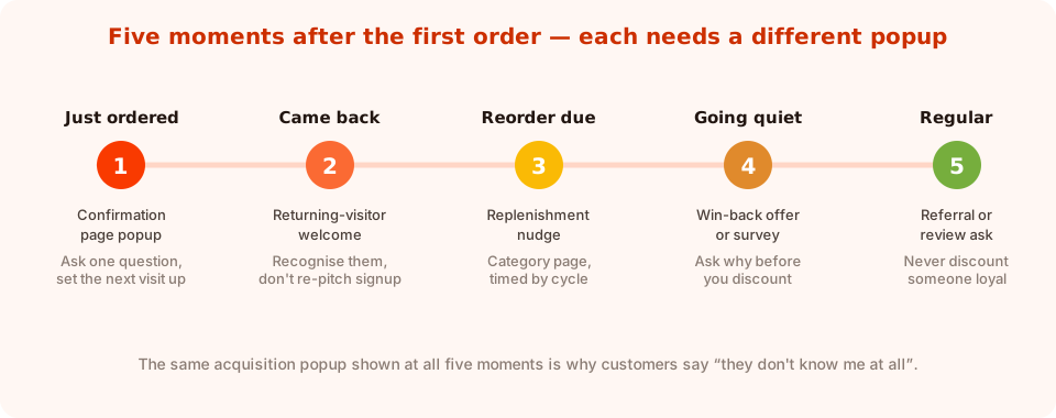
One popup can't serve all five. Five small campaigns can.
1. Just ordered — the confirmation page
The warmest moment you will ever get. They've committed, they're pleased, and they're staring at a page with nothing on it. Use it for exactly one thing:
- A one-question survey (“What nearly stopped you ordering?”) — the highest quality feedback you can collect anywhere.
- Or a preference question that makes the next email relevant (“What should we show you next time?”).
- Or a referral ask, if you have a programme.
Page-target the order-confirmation URL and add a short delay so it lands after they've read the order number. Don't put a discount here — you'd be discounting an order that already happened.
2. Came back — the returning-visitor welcome
Second visit, days or weeks later. Target the returning visitors audience and say something that only makes sense to someone who's been here before:
“Welcome back. New in since your last visit — and your size is in stock.”
Keep the ask tiny: a link to new arrivals, or a single question that segments them. This is the campaign that most obviously signals “we know you”, and it costs nothing.
3. Reorder due — the replenishment nudge
For anything consumable — coffee, skincare, supplements, pet food — there's a natural cycle. Roughly one cycle after a typical order, a returning visitor on the relevant category page is very likely to be there to reorder.
“Running low? Your last blend is one click away.” Button: Reorder now.
A popup can't read your order history, so this one is targeted by page and audience rather than by customer record — more on that limit below. Even the approximate version works, because someone browsing a consumable category as a returning visitor is usually there for the same reason.
4. Going quiet — the win-back
A returning visitor after a long gap. The instinct is to fire a discount; the better first move is to ask a question.
“It's been a while — what would bring you back?” with three or four tappable options: price, found it elsewhere, didn't need it, something went wrong. That answer is worth far more than the margin you'd have given away, and “something went wrong” is a customer you can still save.
Then, on the following visit, make the offer — informed by the answer.
5. Regular — the loyalty and referral ask
Someone who buys often needs no discount at all. Ask them for the things only a happy customer can give:
- A review, with a link to wherever you collect them.
- A referral, if you run one.
- Early access to a launch — a reward that costs nothing and reinforces the relationship.
The display rules that make it a retention popup
There is no “retention” setting. A retention popup is an ordinary popup with four rules set deliberately.
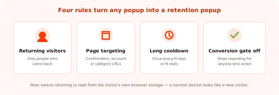
Audience, page, cooldown, conversion gate. That's the whole mechanism.
- Audience: returning visitors. You define what “returning” means in days, so a 30-day window and a 90-day window produce two genuinely different campaigns.
- Page targeting. Confirmation URLs for moment 1, account or category URLs for the others. Rules can match on contains, does not contain, is exactly, is not, starts with or ends with.
- A long frequency cooldown. Retention popups should feel occasional. Once every N days or once every N visits, not every session.
- Show again after conversion: off. Someone who answered the win-back question should never see it again.
Advanced targeting can narrow further — a date window for a seasonal reorder push, a weekday and hour schedule, or device and browser. Every enabled rule is an AND, so add them one at a time and check the campaign still shows.
Know the honest limit. New versus returning is computed from the visitor's own browser storage. Someone on a new phone, a different browser or a private window looks like a brand-new visitor, and a popup has no access to your order history, so it cannot know what someone bought or when. Design retention popups so that being wrong is harmless — “Welcome back” shown to a new visitor is odd but survivable; “Reorder your usual coffee” shown to a stranger is confusing.
Retention popup copy, moment by moment
| Moment | Headline | Button | Rules |
|---|---|---|---|
| Just ordered | “One quick question while that ships” | Send my answer | Confirmation URL, 5s delay |
| Came back | “Welcome back — here's what's new since” | Show me what's new | Returning visitors, once every 7 days |
| Reorder due | “Running low?” | Reorder now | Returning, category pages, long cooldown |
| Going quiet | “It's been a while — what would bring you back?” | Tell us | Returning with a long window, once only |
| Regular | “You've been with us a while. Mind leaving a review?” | Leave a review | Returning, account pages, very low frequency |
Two tone rules across all five. Never re-pitch the signup offer to someone who already converted — turn the conversion gate off on the acquisition popup and this fixes itself. And never fake familiarity: “Welcome back” is fine because it's true of a returning browser; “We've missed you, Sarah” is not, because the popup doesn't know who Sarah is.
A worked example: a coffee subscription store
Five campaigns, built once, running quietly.
1. Confirmation page. Five-second delay on the order-confirmation URL. One question: “How did you pick this roast?” with four options. Feeds the next email and the product page copy.
2. Returning welcome. Corner slide-in, returning visitors, once every seven days: “Welcome back — two new single origins landed this month.” Link, no form.
3. Reorder nudge. Returning visitors on the coffee category page, once every 21 days: “Running low? Same roast, one click.” Button links straight to the category.
4. Win-back question. Returning visitors with a 90-day window, once only: “Been a while — what changed?” with four options and an optional comment.
5. Review ask. Returning visitors on the account page, once every 90 days: “Enjoying the coffee? A two-line review helps more than you'd think.”
Notice how little discounting there is. Four of the five campaigns give away nothing. That's the retention advantage — you're not buying attention, you're using it.
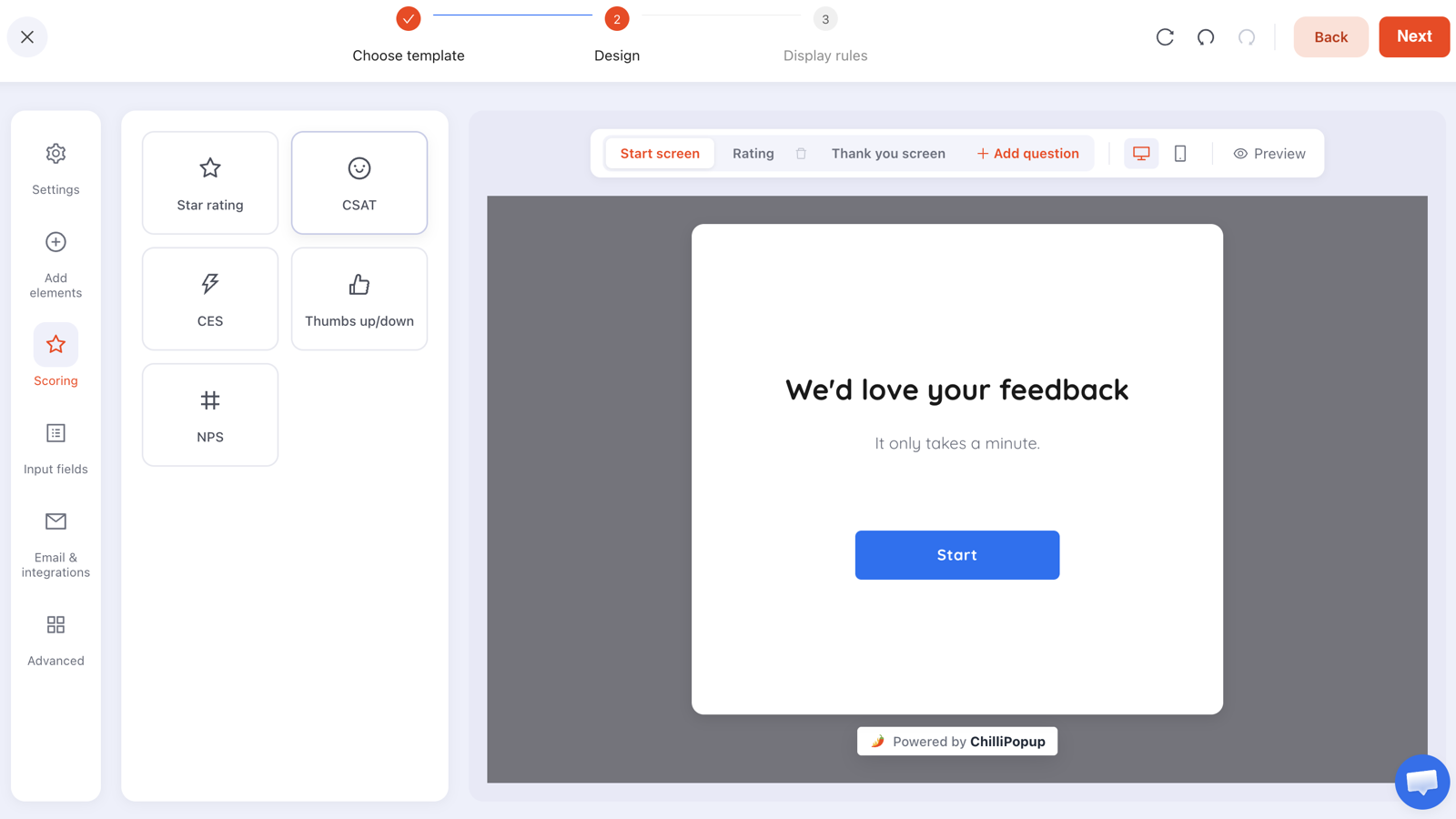
The win-back question, built as a one-step survey with tappable options instead of a text box.
Gamified retention: rewarding a returning customer
Games work particularly well on people who already like you, because the reward feels like a perk rather than a bribe. A spin wheel, scratch card, slot machine or claw machine targeted at returning visitors turns the loyalty moment into something they actively enjoy.
The claim screen is also the best possible place to collect a field you'd never get cold — a birthday month for a birthday offer, or a size for a restock alert. They're claiming a prize they've already won, not filling in a form. The outcome is decided server-side, so it can't be rigged from the browser, and prize codes are never exposed to the page.
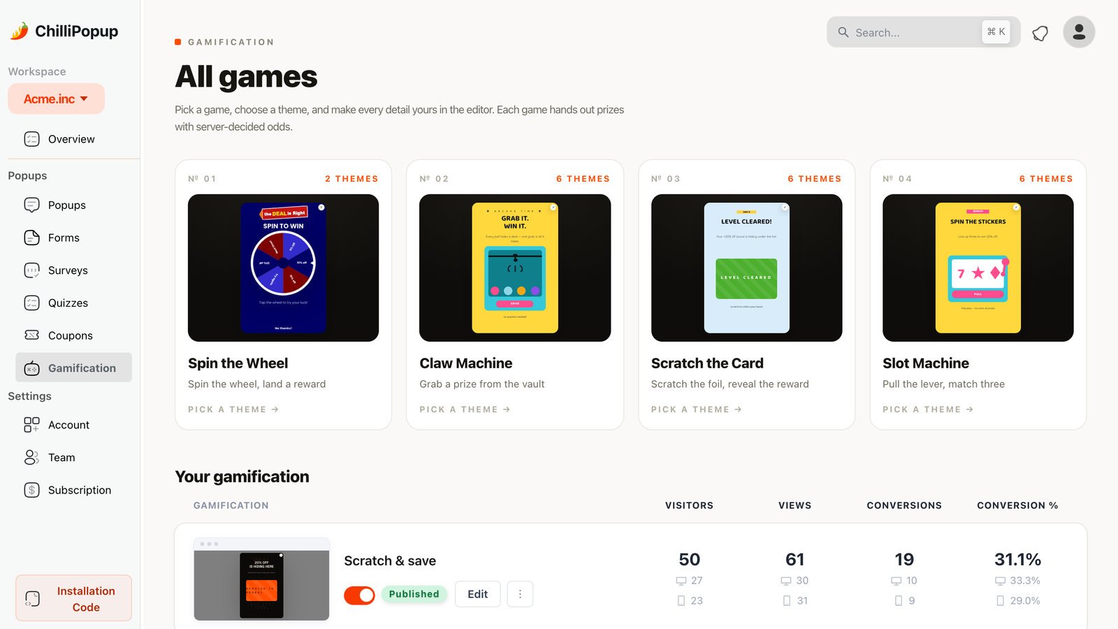
Four game types, all targetable at returning visitors only.
What to measure
Retention campaigns have lower volume than acquisition ones, so read them differently:
- Unique views first. If the returning-visitor window is too tight or the page rule too narrow, the campaign barely shows — and no copy change will fix that.
- Conversion rate against itself. A win-back survey and a signup popup are not comparable events; compare each campaign to its own history.
- The answers, not just the counts. On surveys the value is qualitative — the collected fields breakdown shows the top values per field, and stepped content also records what people typed before leaving without submitting.
- Give it longer. A campaign that only fires for returning visitors on one page needs weeks, not days, to accumulate a readable sample.
Seven retention popup mistakes
- Showing the acquisition popup to customers. Turn off “show again after conversion” and half this problem disappears.
- Discounting people who were going to buy anyway. Regulars get recognition, not margin.
- Faking personal knowledge. The popup doesn't know their name or their order. Write copy that's true of a returning browser.
- Win-back by discount before diagnosis. Ask why first; the answer is cheaper and more useful.
- No cooldown. A retention nudge on every page view reads as nagging from a brand that's supposed to know you.
- Stacking two campaigns in one session. One ask per visit, always.
- Judging a low-volume campaign in a week. Small samples swing wildly; wait.
Build your retention popups in ChilliPopup
Start with two campaigns, not five. If the pixel isn't installed, the install guide takes one line of code — and there are dedicated walkthroughs for Shopify and WordPress.
1. Fix the acquisition popup first
Open your signup popup and turn off “show again after conversion”. Everything else here is wasted if customers still meet the first-order offer.
2. Build the confirmation-page question
A one-question survey, page-targeted to your order-confirmation URL with a short delay. Tappable options, not a text box.
3. Build the returning-visitor welcome
Switch the display frequency rule on, set the audience to returning visitors, choose the day window that matches your buying cycle, and set a weekly cooldown.
4. Add the win-back question with a longer window
Same audience setting, a much longer returning-visitor window, frequency set to show once, and the conversion gate off so an answer retires it.
5. Read the answers after a month
Check unique views first to confirm each campaign is actually firing, then read the collected fields. Rewrite the one question that nobody answers.
Build a popup that recognises your customers
Target returning visitors, specific pages and long cooldowns from one editor. Free plan, no credit card required. Paid plans from $29/month.
Start free →Related reading
Frequently asked questions
What is a customer retention popup?
A customer retention popup is aimed at someone who has already bought from you rather than at a first-time visitor. Instead of a first-order discount it serves a post-purchase moment — a feedback question, a welcome back, a reorder nudge, a win-back question or a review request.
How do I show a popup only to returning visitors?
Switch the display frequency rule on and set the audience to returning visitors, then define how many days count as returning. Combine it with page targeting so the campaign only appears where its offer makes sense, and set a long cooldown so it feels occasional.
Can a popup know what a customer bought?
No. A popup has no access to your order history, and new-versus-returning is computed from the visitor's own browser storage, so a different device or a private window looks like a new visitor. Write retention copy that is true of a returning browser rather than of a named customer.
Should I discount to win a customer back?
Ask before you discount. A one-question popup offering options such as price, found it elsewhere, no longer needed or something went wrong usually costs nothing and identifies a fixable problem. Make the offer on the following visit, informed by the answer.
What should I offer loyal repeat customers?
Recognition rather than margin — early access to a launch, a restock alert, a review or referral request. They were going to buy anyway, so a discount lowers the value of an order you had already earned.
How long should I wait before judging a retention popup?
Weeks rather than days. Retention campaigns are deliberately narrow — returning visitors, specific pages, long cooldowns — so they accumulate views slowly. Check unique views first to confirm the campaign is firing at all before judging its conversion rate.