Course sales have a shape almost nothing else does. Someone reads your free article in March, follows you for four months, and buys in the eight days your enrolment is open in July. Two thirds of your traffic arrives while there is nothing to buy at all.
That rhythm decides which popups are worth running. Capture early with something genuinely useful, keep the waitlist working between launches, then be precise and unignorable during the window when buying is possible. These ten campaigns cover the whole cycle.
Key Takeaways
- Sell a sample, not the course. A real free lesson converts where "join my newsletter" doesn't.
- The waitlist is your highest-value campaign — it monetises the months when nothing is for sale.
- Use real deadlines only. Give launch campaigns a date window so they retire themselves at the close.
- One question beats a profile. Level or goal is the answer that changes which course you recommend.
- Keep marketing out of the course area with URL rules, or your students get sold to.
The course-selling cycle, and where popups fit
Four phases, each with a different job. Almost every mistake in this space is a campaign from one phase left running during another.

Capture, warm, close, teach. Each phase gets its own campaign and its own rules.
| Phase | Visitor state | Campaign | Ask |
|---|---|---|---|
| Discovery | Reading your free content | Free lesson, level quiz | |
| Between launches | Interested, nothing to buy | Waitlist | Email + one question |
| Cart open | Deciding, on a deadline | Countdown, exit catch, objection answer | Enrol |
| After enrolment | Student | Onboarding notice, testimonial ask | Nothing, or feedback |
1. The free lesson capture
Not a newsletter. Not a PDF nobody reads. One real lesson from the actual course — the one that produces the "oh, that's how that works" moment.
"Watch lesson 3 free — the one everyone emails me about."
"Twelve minutes. It's the lesson where the whole thing clicks."
[ email ] [ Send me the lesson ]
Rules: blog and article pages, 50–60% scroll, new visitors, once every 7 days, show again after conversion off. Naming the specific lesson does more work than any design change — it promises something particular rather than "value".
2. The waitlist
The campaign most course creators build last and should build first. While enrolment is closed, your sales page still gets traffic — from search, from old links, from people who finally got round to looking. If the page just says "closed", all of that is wasted.
"Doors open again in September. Want the first email when they do?" One field, plus a single question about their starting level so you know what you're launching to.
Rules: URL targeting on the sales page only, 15-second delay and exit intent, everyone, show again after conversion off. Leave it running permanently between launches — it is the one campaign that should outlive every promotion you run.
3. The which-course quiz
Once you have more than one course, "which should I take?" becomes the question blocking every sale. A three- question quiz answers it better than a comparison table: current level, goal, time available — then a recommendation and an email field to send it to.
It doubles as segmentation: the answers tell you which course to talk about in every subsequent email. The recommendation quiz guide covers the mechanics in depth.
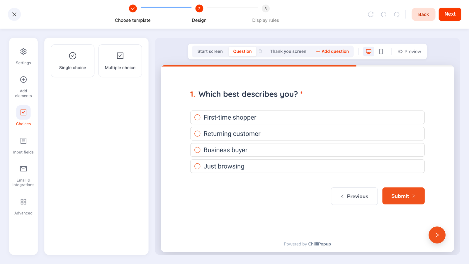
Three questions, one recommendation. It sells better than a feature comparison and segments the list at the same time.
4. The cart-close countdown
During the enrolment window, a slim bar with the real deadline: "Enrolment closes Friday at midnight — 4 spots left in the live cohort." Only if both halves are true.
Rules: site-wide during the launch, all pages all the time, with a date window that starts when the cart opens and ends at the close. That last setting is what stops the deadline outliving the deadline — and a countdown still ticking on Saturday morning costs you more credibility than the urgency ever bought. More on this in the countdown timer guide.
5. The sales-page exit catch
Someone read your whole sales page and left. They're the warmest traffic you will ever have, and they're going. Catch them with the thing that isn't a purchase:
- The syllabus as a PDF — "Want to see exactly what's covered?"
- The payment-plan explainer, if price is your main objection.
- The waitlist, if the cart is closed.
Rules: sales page URL, exit intent (desktop), once per session. Exactly one popup on the sales page — that page is a carefully ordered argument, and interrupting it mid-way competes with the thing doing the selling.
6. The objection answer
Every course has one recurring objection: "will I have time?", "is this for beginners?", "what if it doesn't work for my situation?". Once you know yours — and if you don't, ask, with a short survey — put the answer in a popup on the pricing section, triggered by inactivity.
"Worried about the time? It's four hours a week, and every lesson is under 15 minutes. You keep access forever." No form, one button that scrolls them back to the enrol button. A popup that asks for nothing is allowed to exist.
7. The abandoned-enrolment catch
On your checkout or enrolment page, on exit: "Questions before you enrol? Reply to this and I'll answer personally — or grab the payment plan instead."
For a considered purchase, the objection is almost never price alone — it's risk. Answer it here: refund window, what happens if they fall behind, whether access expires. Keep the popup in a corner so it never covers the payment fields.
8. The bonus-expiry nudge
Mid-launch, when the fast-action bonus is about to end. This works because it's honest scarcity — you set the bonus deadline, so it's real by construction.
Rules: date window covering exactly the bonus period, all pages, once per session. Then it disappears on its own, and you don't have to remember to turn it off at 11pm on a Sunday.
9. The student welcome
Not marketing — orientation. On the members' area or the post-purchase page: "Start here: the 5-minute setup video, then lesson 1."
The number that decides whether people finish your course is whether they start it in the first week. A popup pointing new students at exactly one next action is worth more to your refund rate than any bonus. Target the post-purchase URL, and keep every marketing campaign out of that area with URL rules.
10. The testimonial ask
Two or three weeks in, when students are actually seeing results. A two-question survey: a rating, then "What's changed since you started?"
The answers are your next sales page. Ask permission to quote them in the same survey — a checkbox and a name field — and you'll never have to write a testimonial request email again. You can also send this one as a direct link in your course emails rather than putting it on the site at all.
The display rules that keep it civilised
| Campaign | Pages | Trigger | Frequency |
|---|---|---|---|
| Free lesson | Blog / articles | 50–60% scroll | Every 7 days |
| Waitlist | Sales page | Delay + exit | Every 7 days |
| Course quiz | Course index | 20s delay | Once per session |
| Countdown bar | All pages | Immediate | All pages, all the time |
| Exit catch | Sales page | Exit intent | Once per session |
| Objection answer | Pricing section | Inactivity 45s | Once per session |
| Student welcome | Members area | 5s delay | Once, then off |
Turn off "show again after conversion" on every single one. Course audiences follow you for months. Nothing erodes trust faster than being asked to join a waitlist you joined in March, every week until September.
Six mistakes course creators make with popups
- Selling the course to a cold reader. They arrived from a search result about a problem. Give them a lesson, not a checkout.
- No waitlist between launches. The months when nothing is for sale are when most of your future buyers arrive.
- Fake deadlines. An evergreen countdown that resets is the fastest way to lose an audience that talks to each other.
- Marketing inside the course. Students who paid should not meet a signup popup.
- Three popups on the sales page. One, on exit. The page is the argument.
- Never asking students anything. Your best sales copy is sitting in the heads of people who finished module two.
How to measure a launch
Course launches produce enough noise to justify almost any story afterwards, so decide the numbers before you open the cart. Four are enough:
- Waitlist adds per month between launches. This is your leading indicator, and it's the only one you can improve outside a launch window.
- Free-lesson conversion rate per page. If it varies a lot by article, your best content and your best offer aren't matched yet.
- Sales-page exit-catch submissions. High numbers here mean the page isn't closing — read what those people asked for.
- Quiz answers by option. The distribution tells you which course to build next, which is worth more than the conversions.

Per-campaign numbers, and the answers underneath them. The quiz distribution is often the most useful thing on the page.
Build the waitlist before the launch
Free-lesson captures, waitlists, countdowns and course-matcher quizzes in one editor. Free plan, no credit card required. Paid plans from $29/month.
Start free →Related reading
Frequently asked questions
What is the best popup for an online course creator?
The free-lesson capture, by a distance. A course is an expensive, considered purchase, so the first ask should be a sample rather than a sale — one real lesson, one worksheet, one recorded walkthrough, in exchange for an email you can sell to over the following months.
How do you use popups to fill a course waitlist?
Run a waitlist campaign permanently on your course sales page while enrolment is closed, targeted by URL so it only appears there. It converts the traffic that arrives between launches — which for most creators is the majority of it — and gives your next launch an audience that already raised a hand.
Should a course sales page have a popup?
Yes, but only one, and only on exit or after a long delay. A sales page is a single, carefully sequenced argument; a popup that interrupts mid-argument competes with the thing that does the selling. Catch people on the way out with the waitlist or the free lesson instead.
How do you create urgency around a course launch without lying?
Use real constraints: a genuine enrolment close date, a real cohort start, a limited number of live coaching seats, a bonus that genuinely expires. Give the campaign a date window so it switches itself off at the deadline — a countdown still running the next morning does more damage than no countdown at all.
What should a course popup ask for?
The email, and at most one segmenting question — usually the visitor's starting level or the outcome they want. That single answer changes which course you point them at and which emails they receive, which is worth more than any other field you could collect.
Do popups annoy existing students?
They do if you leave them running site-wide. Restrict campaigns by URL so nothing marketing-related appears inside the course area, and turn off “show again after conversion” so anyone who already joined the list or the waitlist stops being asked.