Most loyalty programmes are not under-designed. They are under-joined. The points work, the tiers work, the rewards page exists — and the only place the programme is mentioned is a link in the footer that 2% of customers have ever clicked.
A loyalty program popup fixes the distribution problem, not the programme. It asks one question at one moment: would you like to keep getting this? The trick is asking it after someone has had the thing, not before.
Key Takeaways
- Ask after the purchase, not before. The order-confirmation page is the highest-converting loyalty signup real estate you own.
- Sell the first benefit, not the points maths. "Free shipping on every order" beats "1 point per euro".
- One field, one button. Enrolment mechanics belong on the programme page.
- A loyalty popup is not a discount popup — different promise, different pages, different metric.
- Plan the handover to your rewards platform before launch, or you will collect intent you cannot act on.
Why loyalty signup popups convert differently
A discount popup makes an offer with a deadline attached: take this now. A loyalty popup makes an offer with a future attached: keep taking this. Those are psychologically different asks, and treating them the same is why most loyalty popups underperform.
| Discount popup | Loyalty signup popup | |
|---|---|---|
| The promise | One saving, now | A standing benefit, from now on |
| Best audience | New visitors | Customers and returning visitors |
| Best page | Product, collection, exit | Order confirmation, account, cart |
| Trigger | Exit intent or scroll | A short delay on the right page |
| Objection it beats | "Not today" | "Is this worth my inbox?" |
| Metric that matters | Conversion rate | Joins per hundred orders — and redemptions after |
| Fails when | The reward is too small | The programme itself is thin |
The honest prerequisite. A popup can only distribute a programme that is worth joining. If your rewards are a points balance nobody redeems, more members means more people discovering that. Fix the first benefit before you fix the signup rate.
The five moments worth a loyalty popup
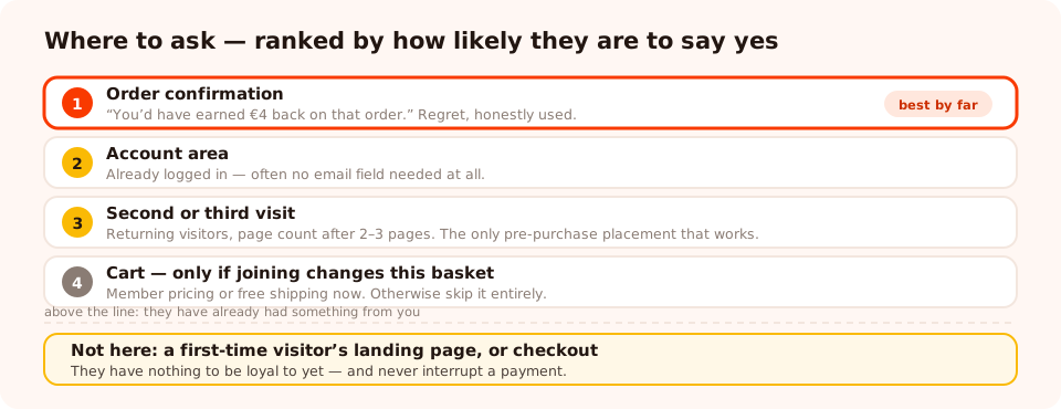
Ranked by how likely the visitor is to say yes. Everything above the line has already had something from you.
1. Straight after an order — the best one by a distance
Target the order-confirmation URL, delay five seconds so the confirmation registers first, and lead with what they just missed: "Members earned €4 back on that order. Join free and start with the next one." Regret is a stronger motivator here than any future promise, and it is honest.
2. In the account area
Someone already logged in and looking at their orders is halfway to being a member. Target the account URL path, and if they are logged in you may not even need an email field — a single button and a link into the programme page does it.
3. On the second or third visit
Set the audience to returning visitors and trigger on page count after two or three pages. This catches the people who browse repeatedly before buying, and it is the only pre-purchase placement that reliably works — because interest has already been demonstrated.
4. At the cart, if membership has first-order value
Only if joining changes this order: members-only pricing, free shipping, a longer returns window. If it does, say the number: "Members pay €42 for this basket. Join free, it applies now." If it does not, skip the cart entirely — you are adding friction to a payment.
5. After a review or a survey response
Someone who just wrote you a review has volunteered goodwill. A popup on the thank-you step of a review request converts well precisely because you are not asking cold.
What the popup should actually say
The single most common mistake is explaining the mechanics. Nobody joins a loyalty programme because the accrual rate is attractive. They join because of one concrete thing that will happen.
| Weak | Stronger | Why |
|---|---|---|
| Join our loyalty programme | Members get free shipping. Always. | Names one benefit instead of a category |
| Earn 1 point per €1 spent | You'd have earned €4 back on that order | Converts an abstraction into a number they recognise |
| Sign up for rewards | Join free — takes one click | Removes the cost objection explicitly |
| Become a VIP member | Members see new drops 48 hours early | Status means nothing; access means something |
| Unlock exclusive benefits | Your birthday gift, member pricing, early access | Three concrete things beat one vague one |
| Submit | Join the club → | Says what the click does |
Keep the whole popup under about 25 words. If your programme has tiers, do not explain them here — link to the programme page and let the popup do one job.
Write the benefit in their currency. "10% back in points" is your accounting. "€4 back on that order" is their experience. The second one is the same fact and it converts because it does not require any arithmetic.
Building it

One benefit, one field, one button — and a thank-you screen that says exactly what happens next.
The settings that matter, in order of how often they are got wrong:
- Turn off "show again after conversion." Nothing damages a loyalty pitch like asking an existing member to join. This is the switch that prevents it — per campaign, for anyone who has submitted that campaign.
- Audience: returning visitors for the pre-purchase campaign; page targeting does the work for the post-purchase one.
- Frequency: a real cooldown — once every 7 or 14 days. Membership is not time-sensitive, so there is no reason to press.
- Exclude checkout. Always, unless the offer genuinely changes the price of the current basket.
- The thank-you screen carries the handover. Say what happens next in one sentence: "Check your inbox to activate your account" or "You're in — your first reward is waiting in your account".
Decide the handover before you launch. Submissions are stored with the campaign; they are not pushed into your rewards platform automatically. Either the popup sends people to your programme's own signup page — the cleanest option, since enrolment happens where the account lives — or you import the captured list on a schedule. What you must not do is collect hundreds of "yes please" and work out the plumbing afterwards.
Put your loyalty programme where customers will see it
Build popups, forms, surveys, quizzes and games from one editor — and one script tag. Free plan, no credit card required. Paid plans from $29/month.
Start free →Two worked examples
A store with a points programme
Campaign 1 — order confirmation. URL contains the thank-you path, five-second delay, headline "You'd have earned €4 back on that order." Body: "Join free and it starts with your next one." One email field, button "Join the club →", thank-you screen pointing to the account page.
Campaign 2 — returning browsers. Audience returning visitors, trigger on page count after three pages, URL contains the collections path, frequency once every 14 days. Headline: "Members get free shipping. Always."
Both have "show again after conversion" off, and campaign 2 excludes the account area so members never meet it.
A service business with a referral-style club
Points do not work here, so the benefit is priority and access. Campaign: a bottom-right corner popup on the account and booking-confirmation pages, headline "Regulars get first pick of Saturday slots", one button, no email field because they are already logged in and clicking through to a page that knows who they are.
Quieter placement, quieter trigger, and it converts because the benefit is the thing every one of those customers has privately wanted.
What to measure
Popup conversion rate is the wrong headline metric here, because a loyalty popup on the order-confirmation page has a tiny, extremely qualified audience. Three better numbers:
- Joins per hundred orders. The honest denominator for the post-purchase campaign.
- Share of members who redeem within 60 days. If this is near zero, your popup is working and your programme is not.
- Second-order rate for members vs non-members. Directional rather than causal — joiners were always going to be your better customers — but if the gap is not there at all, the programme is not doing anything.
Read views and conversion rate in the campaign's own analytics to tune the popup, and treat the three numbers above as the business question. Both are covered in the popup analytics guide.
Six mistakes to avoid
- Pitching membership to a first-time visitor. They have nothing to be loyal to yet.
- Explaining the points maths in the popup. One benefit, one sentence, link for the rest.
- Leaving "show again after conversion" on. Existing members being asked to join is the worst possible impression a rewards programme can make.
- Asking for four fields. The account gets created in your platform. The popup needs an email and a yes.
- Running it over checkout. Unless joining changes the price of this basket, it is pure friction on a payment.
- No plan for what happens after submit. A thank-you screen that says nothing turns a new member into a confused one.
Launch it, step by step
1. Write the one benefit
The concrete thing a member gets, in their currency, in under ten words.
2. Build the post-purchase campaign first
Order-confirmation URL, five-second delay, one email field, a thank-you screen that says what happens next.
3. Turn off "show again after conversion"
Then set a cooldown. Membership is not time-sensitive; there is nothing to press about.
4. Add the returning-visitor campaign
Audience returning, page count after two or three pages, collections or product pages, 14-day frequency.
5. Wire the handover
Send people to your programme's signup page, or schedule the import. Decide before launch.
6. Measure joins per hundred orders — and redemptions
If joins rise and redemptions do not, the popup did its job and the programme needs work.
Related reading
Frequently asked questions
What is a loyalty program popup?
A loyalty program popup is a popup whose only job is to get someone to join your rewards or VIP club. It differs from a discount popup in what it promises: not one saving now, but a standing relationship — points, early access, member pricing — which is why it converts differently and belongs on different pages.
Where should a loyalty signup popup appear?
The order-confirmation page first, because a customer who has just bought is the most likely person on your site to join. After that: the account area, the cart for repeat visitors, and a returning-visitor campaign on collection pages. It does not belong on a first-time visitor's landing page — they have nothing to be loyal to yet.
Should I ask people to join a loyalty program before or after they buy?
After, almost always. Before the first purchase, membership is an abstraction competing with the product; after it, it is a way to get more of something they already chose. The exception is a program with real first-order value, such as members-only pricing, which can be pitched at the cart.
What should the loyalty popup say?
Name the first benefit in concrete terms and skip the mechanics. "Members get free shipping on every order — join in one click" beats "Earn 1 point per euro spent, redeemable at 100 points". Points systems are explained on the programme page, not in a popup with five seconds of attention.
How do I connect a popup signup to my loyalty platform?
In most setups the popup captures the intent and the email, and the enrolment happens in your loyalty or ecommerce platform — either by the customer completing signup on the page you send them to, or by you importing the list. ChilliPopup stores submissions and does not push them into a rewards platform automatically, so plan the handover before you launch.
Is a loyalty popup worth it for a small store?
Only if the programme itself is real. A popup can move people into a rewards scheme that already delivers; it cannot make a thin one worth joining. If your programme is a points balance nobody ever redeems, fix the programme first — the popup will just distribute the disappointment faster.