Five formats, one job description: get something useful from a website visitor without annoying them. A popup interrupts, an inline form waits, a survey asks one question at a time, a quiz gives something back, and a prize game makes the ask feel like a reward.
They are not five styles of the same thing. Each is good at something the others are bad at — and choosing badly is why so many sites end up with a long form nobody finishes, or a quiz that collects data nobody uses.
Key Takeaways
- Pick from the job, not the format. "Grow the list" and "understand the drop-off" need completely different instruments.
- Anything over three fields belongs in steps. One screen per question is the single biggest completion lever there is.
- Only stepped content reports per-question drop-off — and keeps what people typed before abandoning.
- A quiz must give something back. If the visitor gets nothing from answering, you built a survey and mislabelled it.
- The display rules are identical across all of them, so switching format never means relearning the targeting.
The five formats at a glance
| Format | Shape | Best at | Worst at |
|---|---|---|---|
| Popup | One card, over the page | Volume: one field, one offer, maximum reach | Anything that needs more than a sentence of explanation |
| Inline form | One card, in the page | High-intent pages — contact, quote, apply | Reaching people who were not already looking for it |
| Survey | Several steps, one question each | Opinions, ratings and the reasons behind behaviour | Fast list growth — it asks more than it gives |
| Quiz | Several steps, multiple choice | Segmenting while genuinely helping the visitor | Anything where there is no result worth delivering |
| Prize game | A card you play, then claim | Campaign moments — attention and shareability | Serious contexts and B2B, where it reads as unserious |
Start from the job
The fastest way to choose is to finish the sentence "I need to ___" and look it up.
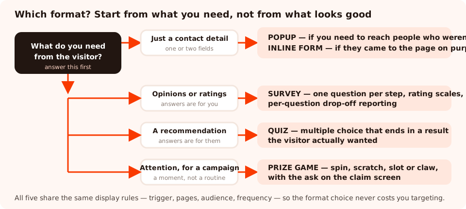
Three questions — what you need, how much it costs the visitor, and whether they get anything back — pick the format for you.
| The job | Format | Why |
|---|---|---|
| Grow an email list fast | Popup, one field | Nothing converts strangers like a single input and a clear reward |
| Let customers contact you | Inline form | They arrived intending to; an overlay would only get in the way |
| Find out why people abandon | Survey, one or two questions | Per-question reporting shows you where they stop, and why |
| Recommend the right product | Quiz | The answers produce a result the visitor actually wanted |
| Measure satisfaction after an order | Survey, one rating step | A scale gives a trend line; free text gives an anecdote |
| Qualify a B2B lead | Quiz or a stepped form | Options return normalised values your team can route on |
| Run a seasonal campaign | Prize game | Play earns attention that a discount banner cannot |
| Enrich subscribers you already have | Quiz, one question | One tap, on a return visit, is the cheapest data you will ever get |
One card, or several steps?
This is the real fork in the road — everything else is styling. A single card asks for everything at once; stepped content asks one thing per screen.
The rule of thumb is three fields. Up to three, a single card is faster and feels lighter. Past three, the card starts reading as paperwork, and splitting the same questions into steps recovers most of the completions you would otherwise lose. On a phone, where a keyboard covers half the screen, the threshold is closer to two.
Fields are decisions, not keystrokes. An email address costs almost nothing once someone has decided to convert. A phone number, a budget range or a company size behaves like an objection. Count the cost of each field, not the number of them.
What only stepped content gives you
Surveys and quizzes report things a single card structurally cannot, because each step is a separate observable moment:
- Per-question drop-off — which question people were last touching when they left. It names the thing to rewrite instead of leaving you to guess.
- Partial answers — what somebody had entered before closing without submitting. A half-finished survey still teaches you something; a half-finished single card teaches you nothing.
- A completion funnel — views, interactions, abandons and submissions, plus completion rate and the average time to finish.
- A progress bar — visible progress is itself a completion mechanism.
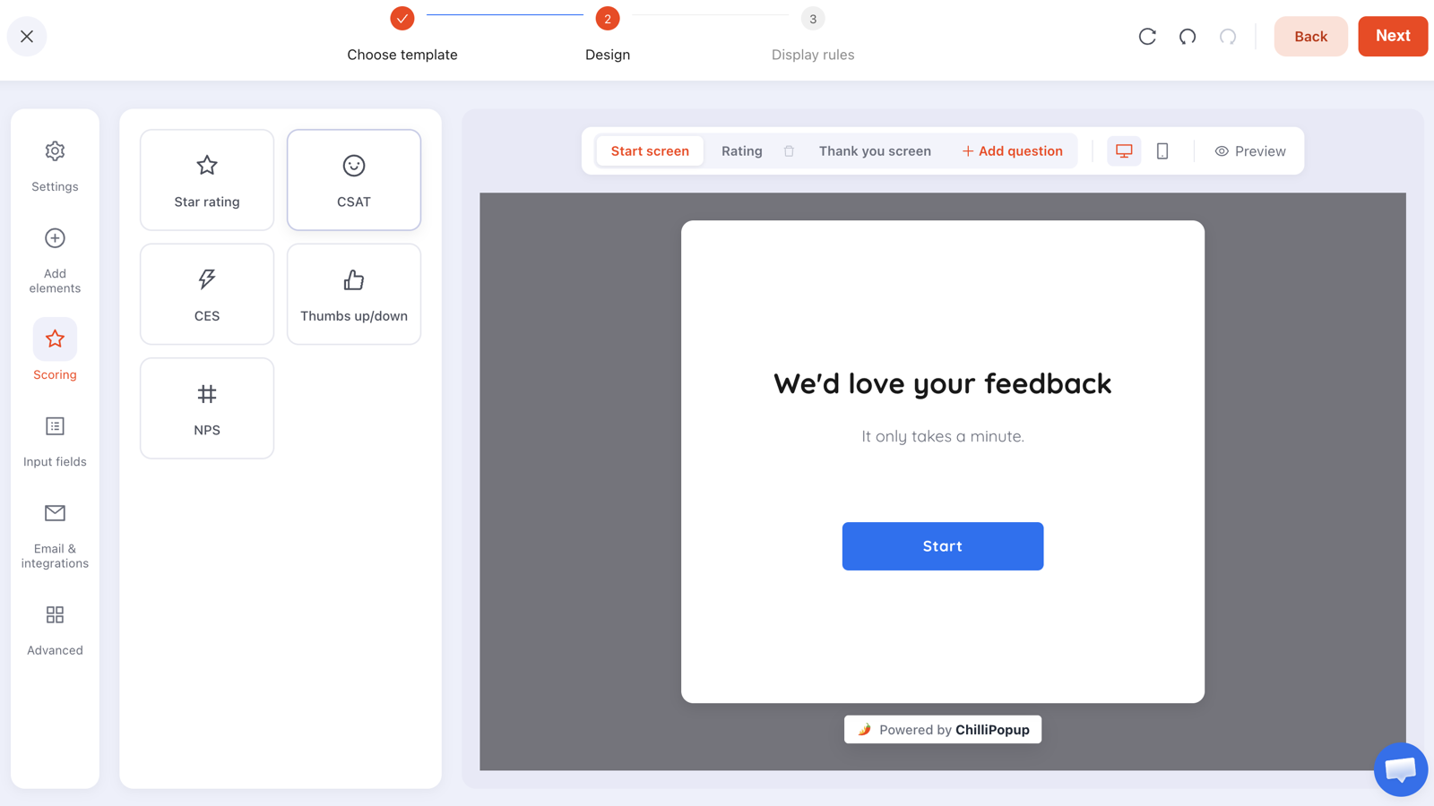
Stepped content is built one screen at a time, which is also why it can report one screen at a time.
One constraint worth designing around: steps run in order. There is no branching — no "if they answer Kids, jump to question five". Keep questions universal so every path makes sense, or run two shorter campaigns targeted at different pages when the audiences genuinely need different questions.
Survey or quiz?
Both are stepped. Both collect answers. The difference is who the answers are for.
- A survey collects opinions for you. Its natural question type is a rating — stars, thumbs, a satisfaction scale, an effort scale, a recommendation score — and the visitor's reward is being heard.
- A quiz collects choices for the visitor. Its natural question type is multiple choice, and the answers feed a result: a recommendation, a diagnosis, a shortlist.
That distinction has a practical consequence. A quiz can justify five questions because each one visibly improves the result. A survey cannot — every extra question is a favour you are asking, and the response rate says so. If you find yourself writing a seven-question survey, check whether you are really building a quiz and forgetting to give anything back.
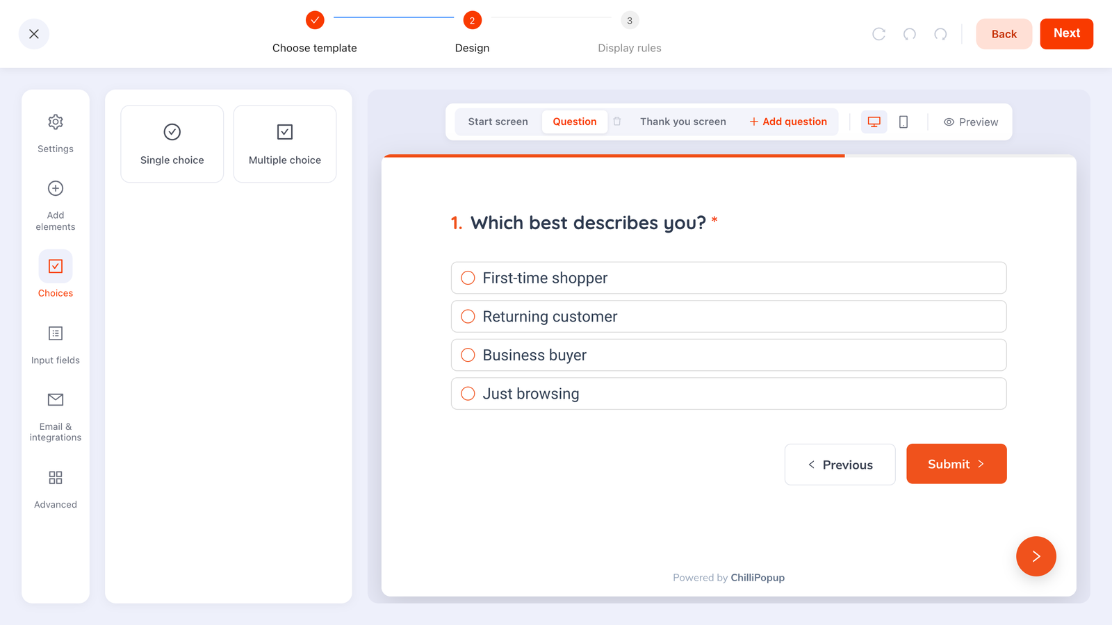
Options beat text boxes in both formats: one gesture to answer, and values you can actually group afterwards.
Where each format can appear
Format and placement are separate choices, which is easy to forget. Any of these can be triggered over the page; some can also sit in the page or live on their own link.
| Placement | What it is | Use it when |
|---|---|---|
| Triggered overlay | Appears over the page on a trigger you choose | You need to reach people who were not looking for it |
| Inline in the page | Rendered into a container in your own markup | The page is the right place and interruption is not needed |
| A shareable link | Its own hosted page you can send anywhere | Email campaigns, social posts, QR codes, offline |
The same content can be reached more than one way — a survey embedded in a page for site visitors and sent as a link to your customer list, without rebuilding it. The shareable link guide and the form embedding guide cover the mechanics.
All five formats, one editor
Popups, forms, surveys, quizzes and prize games — same builder, same display rules, one script tag. Free plan, no credit card required. Paid plans from $29/month.
Start free →What each format costs the visitor
Every format sits somewhere on a trade between what you get and what you charge for it. Plot your campaigns on it once and the gaps are obvious.
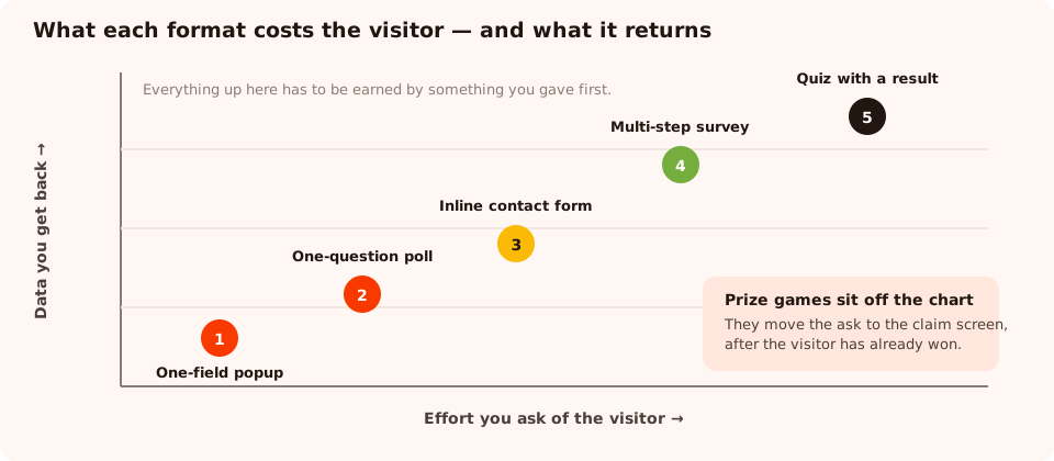
Nothing is wrong with the top-right — it just has to be earned by something you gave first.
Read it as a sequence rather than a ranking. Strangers get the cheap ask. People who have already received something can be asked for more. And the expensive formats — the ones in the top right — work best after a purchase, a delivered discount or a genuinely useful result, which is exactly why a prize game puts its ask on the claim screen rather than the start screen.
How they fit together
The strongest setups run several formats at once, each doing one job, ruled so they never collide:
- A one-field popup for first-time visitors, exit intent on desktop and scroll on mobile. This is your volume.
- An inline form on the contact, quote or demo pages, always visible, interrupting nobody.
- A one-question quiz for returning visitors, to segment the people already on your list.
- A one-question survey on the order-confirmation page, asking how easy that was.
- A prize game for the two or three campaign moments a year that deserve one.
The discipline that holds it together is one ask per visit. Two campaigns firing in the same session is how a thoughtful set of formats turns into an interrogation — and the frequency rules exist precisely so you can stop that happening.
Five ways teams choose wrong
- A six-field form on a popup. The format with the least patience carrying the ask with the most friction.
- A survey with no reward and seven questions. Either shorten it or turn it into a quiz that gives something back.
- A quiz whose result is "thanks!" — all the cost of a quiz, none of the payoff.
- An inline form on a page nobody visits with intent. Inline only works where the visitor already wants to do the thing.
- A prize game in a serious context. A spin wheel on a bereavement service, a legal firm or an enterprise pricing page reads as tone-deaf, however well it converts elsewhere.
Related reading
Frequently asked questions
What is the difference between a form and a survey?
A form is a single card that collects a set of fields in one go — name, email, message. A survey splits its questions across steps, one screen at a time, which raises completion on anything longer than about three fields and produces per-question reporting a single card cannot. If you are collecting contact details, use a form. If you are collecting opinions, use a survey.
Should I use a quiz or a survey?
It depends on who the answers are for. A survey collects opinions for you: ratings, satisfaction, effort, what people think. A quiz gives something back to the visitor — a recommendation, a result, a diagnosis — and the answers are the input to that. If the visitor gets nothing from answering, you have a survey, and you should say so.
Is an inline form better than a popup?
It is quieter, not better. An inline form waits on the page and interrupts nobody, so it suits high-intent pages where people arrive intending to contact you. A popup reaches people who were not looking for it, which is why it captures more addresses and irritates more visitors. Most sites should run both, on different pages.
Can I use the same display rules for all of these?
Yes. Popups, forms, surveys and quizzes all share one display-rules model — the same triggers, page targeting, audience, frequency and conversion gate. Choosing a format is a decision about the asking, not about the targeting, and everything you learn about rules transfers between them.
Which format gets the highest conversion rate?
The one asking for the least at the moment of highest intent, which is usually a single-field popup. But conversion rate is the wrong comparison across formats: a quiz that converts at half the rate of a discount popup delivers segmented, self-declared data that the popup never could. Compare each format against itself over time, not against the others.
Do I have to choose just one?
No, and you should not. The strongest setup runs several: a single-field capture for strangers, a quiz or survey for the people who come back, an inline form on the pages where people arrive ready to talk, and a prize game for campaign moments. One ask per visit is the rule that keeps that from feeling like an interrogation.