Form abandonment is the gap between the people who started filling in your form and the people who finished. They clicked into a field. They typed something. Then they left — which means the offer worked, the placement worked, and something inside the form itself lost them.
That makes abandonment the most fixable metric on your site. A form nobody touches has a demand problem. A form people start and quit has a design problem, and design problems have specific, boring, effective fixes.
Key Takeaways
- Abandonment ≠ low conversion. One means people quit partway; the other means they never engaged. Different diagnoses, different fixes.
- Count fields by cost, not quantity. An email is nearly free; a phone number reads as an objection.
- Validate while typing, not on submit. A form that rejects everything at once after 40 seconds of work is a form people abandon.
- The mobile keyboard is the most common invisible cause — it covers the button on half the phones you never tested.
- Partial answers are data. On stepped content, what someone typed before leaving is recorded, and it tells you exactly which question to rewrite.
Abandonment is not the same as a low conversion rate
These get treated as one number and they should not be. Picture the same form on the same page for 1,000 visitors:
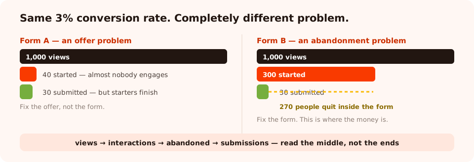
Two forms can share a conversion rate and have completely different problems. The middle of the funnel tells you which one you have.
- Form A: 1,000 views, 40 people started, 30 submitted. Almost nobody engages, but those who do finish. That is an offer problem — the reward is not worth the form.
- Form B: 1,000 views, 300 people started, 30 submitted. Loads of intent, and 90% of it evaporates inside the form. That is an abandonment problem, and it is worth far more to fix.
Same 3% conversion rate. Completely different work. So before you rewrite a headline, find out which form you have. In ChilliPopup, surveys and quizzes report a four-stage funnel — views, interactions, abandoned, submissions — along with completion rate and average time to finish, which is exactly this distinction made visible.
The five reasons people abandon a form
1. A field they did not expect
Fields are not equal. Once someone has decided to claim your discount, typing an email is nearly free — they always knew you would need a way to reach them. A phone number, a company size, a birthday or a budget range behaves completely differently: it arrives as a surprise, and a surprise mid-form reads as an objection. Count cost per field, not number of fields.
2. A required field they cannot answer honestly
Ask a browsing consumer for "Company" and mark it required and you have created a dead end for
everyone who does not have one. Some will type n/a. More will leave. Requiredness is the
single most over-used setting in form design.
3. Validation that only speaks after submit
The worst pattern in forms: fill everything in, press the button, and get a wall of red. The visitor
has now done all the work and been told none of it counted. Validate as they type, and make the
message specific — "that looks like gmial.com, did you mean gmail.com?"
saves a signup; "invalid input" loses one.
4. A form longer than the reward justifies
Every form is an exchange, and visitors price it instantly. Six fields for a 10% discount is a bad trade and they know it. Six fields for a custom quote on a €9,000 machine is fine. If you cannot shorten the form, raise the reward — or say what they get, more concretely, right above the first field.
5. The mobile keyboard
This one is invisible on a desktop and enormous in the data. Tap a field on a phone and the keyboard eats half the viewport. If your submit button is now below the fold, inside a scrollable panel, next to a close button, on a form the visitor cannot see the top of — they will not fight it. Open your own form on a real phone and try to submit it with one thumb.
The sixth reason, which is not a design problem: some abandonment is healthy. People who open a form, see what it asks, and decide they are not the customer have saved you a bad lead. Chase completion rate too hard and you buy junk.
How to find the field that is losing people
A submit count cannot tell you where someone gave up. You need something per-field, and there are three sources worth using.
| Source | What it tells you | Available on |
|---|---|---|
| Drop-off ranking | Which question people quit on, from the last field they touched | Stepped content — surveys and quizzes |
| Partial responses | What they actually typed before leaving without submitting | Stepped content |
| Collected field values | The top values per field — where the junk is | All content types |
| Completion rate & average time | Whether the form is long, or just badly ordered | Surveys and quizzes |
| Views vs interactions | Offer problem or abandonment problem | Surveys and quizzes |

Read the middle of the funnel first. Views tell you about reach; interactions and abandons tell you about the form.
An honest limit worth planning around. Partial capture applies to stepped content. A single-screen popup or form that someone types into and closes leaves no partial record — so if diagnosing abandonment matters to you, build the long form as a stepped survey and you get the drop-off ranking for free.
Seven fixes, in the order worth trying them
- Delete a field. Run the so-what test: name the exact email, segment or sales action that changes because of this answer. No name, no field. This is the highest-yield change available and it costs nothing.
- Make a field optional. If you cannot delete it, un-require it. You keep the answers from people happy to give them and stop losing everyone else.
- Move validation into the typing. Check the email as it is entered, with a typo guard for common domain misspellings. If your list quality matters more than raw volume you can also restrict to business addresses — just be aware that is a deliberate trade, not a free win.
- Rewrite the label as a question. "Where should we send it?" outperforms "Email address" because it explains why you are asking at the moment of asking.
- Replace a text input with options. Three to five tappable choices complete in one
gesture, work on a phone, and return normalised values you can segment on instead of
Mktg,marketing opsandMarketing. - Fix the mobile layout. Big tap targets, the button reachable with the keyboard open, a close control that is not adjacent to the submit button.
- Split it into steps — last. Above about four fields, one question per screen genuinely helps. Below that it adds taps for nothing.
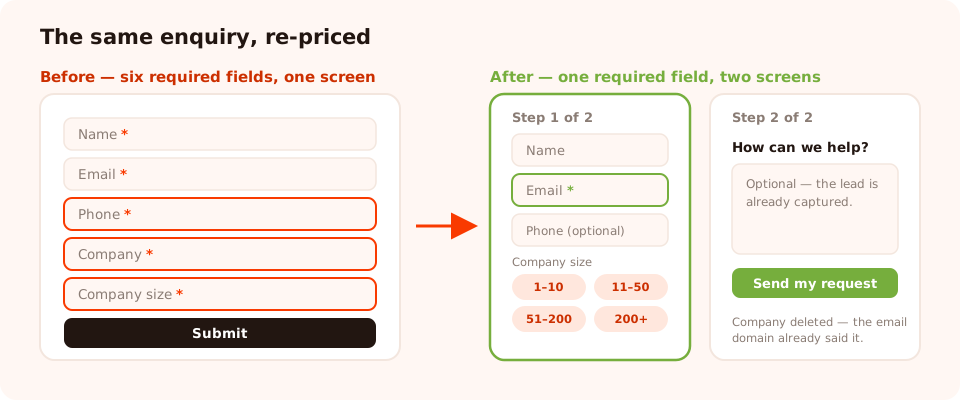
The same information, re-priced. Every field that survived can name the thing that changes because of it.
A worked example
A B2B services site runs a "Request a quote" form with six required fields: name, email, phone, company, company size, and a free-text "How can we help?". It gets a lot of starts and few finishes.
What the data said. Interactions were healthy — people wanted the quote. Drop-off clustered on the phone number, and the free-text box collected mostly one-word answers.
What changed.
- Phone — kept, but made optional, with the label rewritten to "Phone (only if you'd rather we call)". That single word "only" reframes it from a demand into a choice.
- Company size — converted from a text input to four options, because the answer was only ever used to route the enquiry.
- "How can we help?" — kept but moved to a second step, so the contactable lead is already captured before the essay question appears.
- Company name — deleted. Nothing in the process used it that the email domain did not already tell them.
Result shape, not a number: fewer fields on screen one, the same routing information, and the enquiries that would have been abandoned now arrive as a completed first step. Whether it worked for you is a question for your own funnel — measure the same form before and after, and if you want certainty rather than a hunch, run it as an A/B test.
Find out where your form loses people
Build popups, forms, surveys, quizzes and games from one editor — and one script tag. Free plan, no credit card required. Paid plans from $29/month.
Start free →Where the form lives matters too
Abandonment is not only about fields. The same form abandons at different rates depending on how it is presented:
| Presentation | Abandonment tendency | Use when |
|---|---|---|
| Inline on the page | Lowest — the visitor chose to scroll to it | Contact pages, pricing pages, long articles |
| Triggered overlay | Higher — the visitor did not ask for it | Offers with a real reward attached |
| Behind a button | Low — opening it is already a commitment | Quote requests, demos, applications |
| Stepped survey | Lower per screen, and you can see where it fails | Anything over four fields |
| Behind a game | Lowest of all for expensive fields | When you need a birthday or a phone number |
That last row is worth taking seriously. A spin wheel or scratch card puts the ask on the claim screen: the visitor plays, wins, and the form is what reveals the prize. The exact fields that would have destroyed a cold form are tolerated happily once someone is claiming something they already won.
And if the form belongs in the page rather than over it, the four embed modes — inline, button, lightbox and sidebar — let you choose the level of interruption without rebuilding the form.
Six mistakes that create abandonment
- Adding a field "while we have them". The most common cause, and the one with the clearest fix.
- Requiring everything by default. Required should be the exception you justify, not the setting you leave alone.
- Error messages that blame the visitor. "Invalid input" tells them nothing. Say what you expected.
- No indication of what happens next. People hesitate at the button when they do not know whether they are about to be called by a salesperson. One line under the button fixes it.
- Testing only on a desktop. The keyboard problem is invisible until you use a phone.
- Optimising completion rate above all. A form everybody finishes may just be a form that qualifies nobody. Watch the quality of what arrives, not only the volume.
Fix your form, step by step
1. Separate the two problems
Look at views versus interactions. Nobody starting is an offer problem; people starting and quitting is abandonment.
2. Find the losing field
Read the drop-off ranking and the partial answers on stepped content, and the collected values on everything else.
3. Delete or demote it
Run the so-what test. Nothing changes because of the answer? Delete the field, don't move it.
4. Move validation into the typing
Check the email format as it is entered, with a typo guard, and write error text that says what you expected.
5. Open it on a real phone
Tap the first field and try to reach the button with the keyboard open. Fix what you find.
6. Split it only if it is genuinely long
Over four fields, rebuild as a stepped survey — and you get the per-question drop-off ranking as a bonus.
7. Re-measure in two weeks
Same form, same pages, one change at a time. Compare it against itself, never against a published benchmark.
Related reading
Frequently asked questions
What is form abandonment?
Form abandonment is when someone starts filling in a form — clicks a field, types something — and then leaves without submitting it. It is different from a form that nobody interacts with at all: an abandoned form had a willing visitor who changed their mind partway through, which makes it the most diagnosable kind of lost conversion you have.
What is a normal form abandonment rate?
There is no useful universal number, because it depends entirely on what you are asking for and where. A three-field newsletter form and an eight-field quote request are not comparable, and neither is a form on a pricing page versus one on a blog post. Measure your own form against itself over time and treat any published benchmark as trivia.
Why do visitors abandon forms?
Five reasons cover almost all of it: a field they did not expect to have to give (phone number, company, birthday), a required field they cannot answer honestly, an error message that appears after submit instead of during typing, a form that is longer than the reward justifies, and a mobile keyboard that hides the button. Each one has a different fix.
How do I find out which field people quit on?
You need per-field data, not just a submit count. On stepped content — surveys and quizzes — ChilliPopup records what a visitor entered before leaving without submitting, and the results view ranks the questions people quit on based on the last field they touched. That drop-off ranking is your rewrite list.
Does splitting a form into steps reduce abandonment?
Usually yes for anything over four fields, because each screen is a smaller commitment and progress creates momentum. It is not free: steps add taps, and a text field that is revisited after stepping backwards comes back empty and has to be retyped. Split when the form is genuinely long; do not split a three-field form into three screens.
Should I make fewer fields required?
Almost always. A required field you do not act on produces compliance, not data — phone numbers of 0000000000 and company names of asdf. Before a field is required, name the exact email, segment or action that changes because of the answer. If you cannot, make it optional or delete it.