An exit survey asks one question of someone who is about to leave: why? It does not discount, beg or bargain. It collects the reason a visitor did not convert, in their words, at the exact moment they still remember it.
That makes it the cheapest customer research a website can run. An exit-intent discount rescues this visitor. An exit survey fixes the page for the next thousand — and most sites have never once asked.
Key Takeaways
- One question. Three to five options. An "other". That is the entire format.
- Run it where a decision is lost — cart, pricing, key product pages. Never site-wide.
- Options beat free text. Taps get answered; essay boxes get skipped by everyone except people who were already going to complain.
- Exit intent needs a mobile plan — there is no cursor on a phone, so use inactivity or scroll instead.
- The output is a page change, not a report. If nothing on the site changes, stop running the survey.
Exit survey or exit-intent offer?
Both fire on the same signal and they do opposite jobs. The mistake is stacking them into one popup — "before you go, here's 10% off, and also, why were you leaving?" — which converts on neither.
| Exit-intent offer | Exit survey | |
|---|---|---|
| What it does | Rescues this visitor | Improves the page for the next ones |
| Ask | An email, for a reward | One tap, for nothing |
| Response rate | Low — it is a commitment | Higher — it costs one tap |
| Payoff timing | Immediate | Weeks later, and permanent |
| Risk | Trains people to wait for discounts | Nobody acts on the answers |
| Best page | Product, collection, cart | Cart, pricing, checkout entry |
Run them side by side, not stacked. Put the offer on product and collection pages and the survey on the cart and pricing page. Or alternate: offer for a month, survey for a month. What you must not do is put both in the same popup.
What to ask, page by page
The question is always a variant of "what stopped you". What changes is the option list, and the option list is where all the value is — it has to name the objections you actually suspect, including the one you would rather not hear.
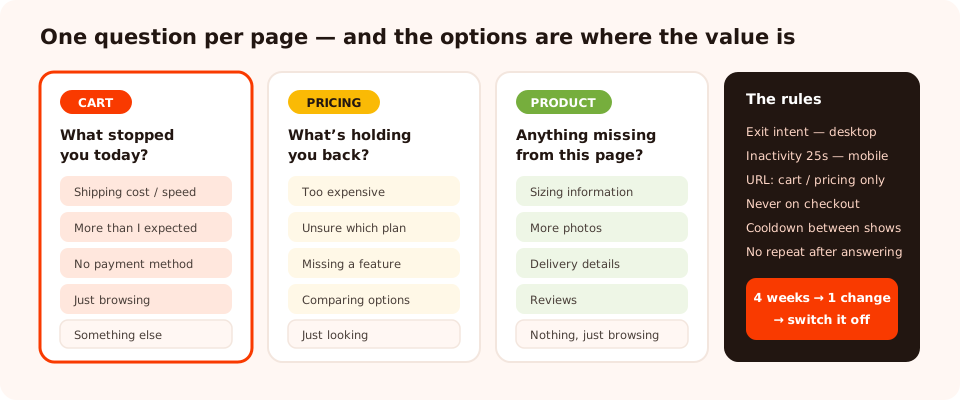
Same shape everywhere: one question, real objections as options, an escape hatch at the bottom.
On the cart
"What stopped you today?"
- Shipping cost or delivery time
- The price is more than I expected
- My payment method isn't there
- I was just browsing
- Something else
If shipping wins — and on most stores it does — that is not a popup problem, it is a threshold and messaging problem, and you now have evidence for the argument.
On a pricing page
"What's holding you back?"
- Too expensive for us right now
- I'm not sure which plan I need
- Missing something we need
- Still comparing options
- Just looking
"I'm not sure which plan I need" is the most actionable answer on this list, because it is a page problem you can fix this week rather than a pricing decision you cannot.
On a product page
"Anything missing from this page?" — sizing information, more photos, delivery details, reviews, or nothing, just browsing. This is the survey that most often produces a merchandising change rather than a marketing one.
On a long article or landing page
"Did this answer your question?" — yes; partly; no, I was looking for something else. Pair the "no" with a follow-up text field and you have a content roadmap written by the people who needed it.
How to build one
There is one product decision to get right first, and it decides which content type you build.
| You want the visitor to… | Build a… | Because |
|---|---|---|
| Tap one of several written reasons | Quiz | Multiple-choice options live on quizzes |
| Rate something on a scale | Survey | NPS, CSAT, CES, stars and thumbs live on surveys |
| Type a sentence | Either | Both support text inputs |
| Rate, then explain | Survey with two steps | The scale first, the text box second |
| Pick a reason, then explain | Quiz with two steps | Options first, optional text second |
For the classic "why are you leaving" exit survey with tappable reasons, that means a quiz — the label on the tool matters less than the answer format you need. If you want a satisfaction score instead, that is a survey.
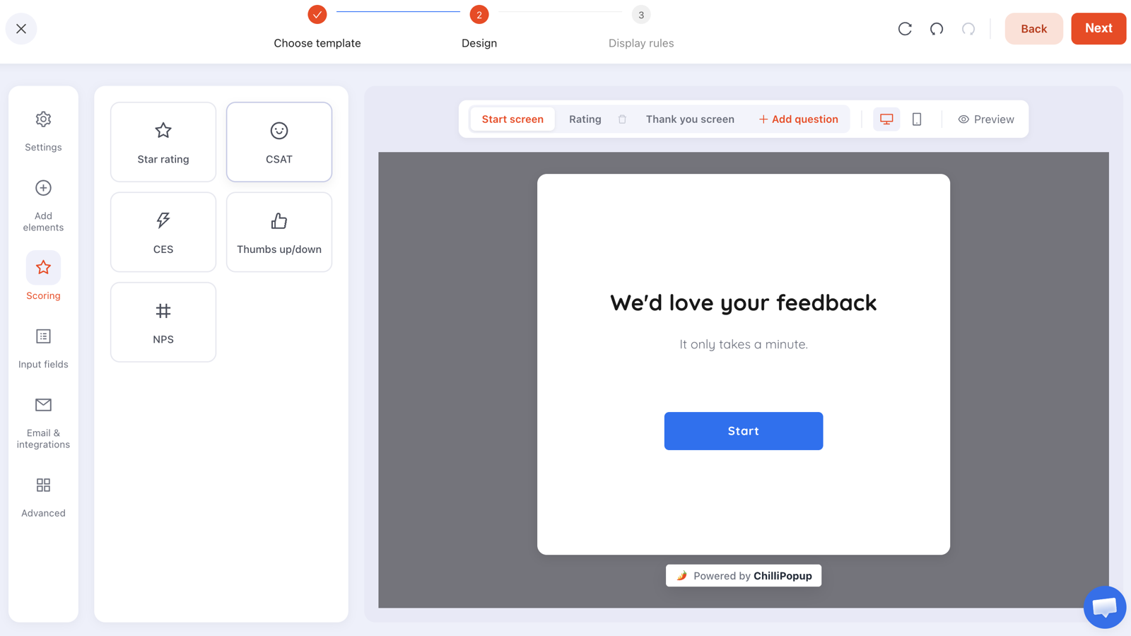
Steps are built one screen at a time. For an exit survey you usually want exactly one question step plus a thank-you.
The display rules
- Trigger: exit intent on desktop. On mobile there is no cursor, so use inactivity (around 20–30 seconds) or a scroll threshold instead — either as a second trigger on the same campaign, or as a separate device-targeted campaign with the same question.
- Pages: URL rules pinning it to the cart, pricing or product paths. Site-wide exit surveys collect noise.
- Frequency: a cooldown, so someone who dismissed it is not asked again on the next page view.
- Show again after conversion: off. Somebody who answered should never be asked twice.
- Never on checkout. Exclude the payment steps entirely; the one page worth an exception is the order confirmation, and that is a post-purchase survey, not an exit one.
Keep it to one step if you can. Every extra screen on an exit survey costs responses, and the visitor was already leaving. If you want a follow-up text box, make it a second step that is entirely optional — the answer you needed is already recorded by then.
Ask why, before they leave
Build popups, forms, surveys, quizzes and games from one editor — and one script tag. Free plan, no credit card required. Paid plans from $29/month.
Start free →Reading the answers
Exit surveys produce two kinds of data, and most teams only look at one of them.

Count the options first. The four-stage funnel — views, interactions, abandoned, submissions — tells you whether the question itself is the problem.
- The option counts — the obvious half. Rank them, and act on the top one.
- The drop-off and partial answers — the half people miss. If a large share of visitors open the survey and quit without answering, your options do not contain their reason, or the question reads like an accusation. Partial responses show what people typed before leaving, which is often the most honest data you will get all quarter.
- Completion rate and average time — an exit survey should complete in a few seconds. If the average time is long, the option list is too long or too wordy.
The rule that makes this worth doing: every exit survey needs an owner and an end date. Run it for four weeks, decide one change, ship the change, and turn the survey off. A survey that runs forever and changes nothing is just a tax on people leaving your site.
A worked example
A store selling furniture puts a one-question quiz on the cart, exit intent on desktop and 25 seconds of inactivity on mobile.
Question: "Before you go — what stopped you?"
Options: delivery is too slow · shipping costs too much · I want to see
it in person first · the price · just browsing.
What that list is designed to separate. "Delivery too slow" and "shipping costs too much" look similar and lead to completely different fixes — one is a logistics promise on the product page, the other is a threshold change. "I want to see it in person" is not a website problem at all, and knowing what share of your abandonment is that keeps you from over-optimising the cart.
What happens next. After four weeks the winning option becomes one change: a delivery estimate moved above the fold, a free-shipping threshold stated on the cart, or a room-visualiser link added to the product page. Then the survey is switched off, the change gets a month to breathe, and the cart conversion rate is compared against itself.
Six mistakes to avoid
- Asking more than one question. They were leaving. You get one.
- A free-text box as the only input. You will get twelve answers, eleven of them from people who were already going to email you.
- Options that do not include the real reason. If "your price is too high" is not on the list, your data will cheerfully tell you price is not a problem.
- Running it site-wide. A visitor leaving your careers page cannot tell you anything useful about your cart.
- Forgetting mobile. Exit intent needs a cursor. Without a mobile trigger you are surveying half your traffic and calling it all of it.
- Collecting answers nobody owns. The most common failure by far: four weeks of clean data, zero changes shipped.
Launch your exit survey, step by step
1. Pick one page where a decision is lost
Cart, pricing, or your highest-traffic product page. One page, one campaign.
2. Write one question and its options
Three to five real objections, including the uncomfortable one, plus "something else".
3. Build it as the right content type
Tappable reasons → a quiz. A rating scale → a survey. Both can add a text step after.
4. Set exit intent, with a mobile fallback
Inactivity or scroll for phones. Exclude checkout entirely.
5. Cap the frequency and the repeats
A cooldown between showings, and "show again after conversion" turned off.
6. Four weeks, one change, then switch it off
Count the options, read the partial answers, ship one fix, and stop the survey.
Related reading
Frequently asked questions
What is an exit survey?
An exit survey is a one-question survey that appears when a visitor is about to leave a page without converting, and asks why. Unlike an exit-intent discount, it does not try to rescue the sale — it collects the reason, which is worth more because it tells you what to change for the next thousand visitors.
What should an exit survey ask?
One question, with three to five tappable options and an "other" escape. On a cart: "What stopped you today?" with shipping cost, price, payment method, and just browsing. On a pricing page: "What's holding you back?" with too expensive, missing a feature, comparing options, and not ready yet. Never ask two questions.
Where should an exit survey appear?
On the pages where a decision is being lost: the cart, the pricing page, a high-traffic product page, or a long-form landing page. It should not run site-wide — someone leaving your About page has no useful answer to give you, and asking dilutes the responses that matter.
Should I offer a discount instead of asking why?
Run both, on different pages or at different times — not in the same popup. A discount recovers this visitor; a survey improves the page for everyone after them. If you only ever rescue, you keep paying for the same problem forever.
How many responses do I need before acting?
Enough that one loud person is not steering your roadmap — in practice, a few dozen per option before a pattern is real. Because you are counting options rather than reading essays, patterns show up quickly. Give it two weeks before you decide anything.
Should exit survey answers be multiple choice or free text?
Multiple choice, with an optional free-text follow-up. Options complete in one tap, work on a phone, and produce values you can count. A free-text box collects thoughtful answers from people who were already going to email you, and nothing from everyone else.