Most popup advice is written for shops. It assumes a discount, an impulse and a customer worth twenty pounds. An agency has none of those: no coupon to hand out, a considered purchase measured in months, and a client worth more than a year of ecommerce signups.
So the goal changes. An agency site does not need more email addresses — it needs more of the right conversations, and popups that respect the fact that its visitors are buying judgement rather than a product.
Key Takeaways
- Offer proof, not a discount. A teardown, a checklist or a relevant case study — something useful even to someone who never hires you.
- Case study pages are the best real estate on the site. The visitor is already imagining the work applied to their business.
- Qualify with two taps, not a form. Service and budget band as options, never as text fields.
- Two to four campaigns, maximum. A site selling expertise cannot look desperate.
- Measure enquiries, not signups. Four good projects a year will never be statistically significant, and that is fine.
The three kinds of traffic an agency site gets
Every agency site has the same three audiences, arriving with completely different intentions. Treating them identically is the root of most bad agency lead capture.
| Who | Where they land | What they want | The right ask |
|---|---|---|---|
| The researcher | A blog post, from search | To solve today's problem themselves | Something useful, in exchange for an email |
| The evaluator | Case studies, the work, the team | To know whether you have done this before | A relevant example, or a short conversation |
| The buyer | Services, pricing, contact | To find out if you fit their budget and timeline | A faster route to a call, with two qualifying taps |
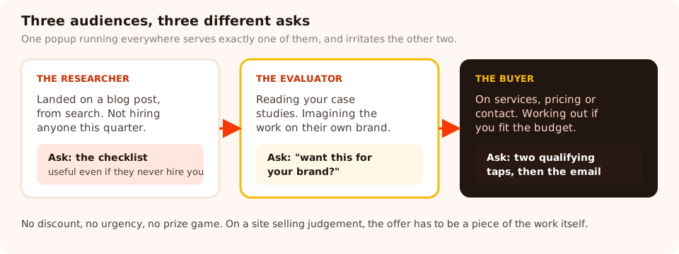
Same site, three different intentions. One popup running everywhere serves exactly one of them.
Five popups worth running
1. The teardown, on blog posts
Your blog gets researchers. They are not ready to hire anybody, and pretending otherwise wastes the visit. Offer the thing that proves you can do the work.
Headline: Want the checklist we actually use?
Sub-line: The one-page audit we run on every new project. No signup wall, no sequence — one email, one file.
Field: email · Button: Send me the checklist
Rules: 55% scroll · blog URLs only · new and returning · once every 30 days
2. The "want this for your brand?", on case studies
The highest-intent page you own, and the one most agencies leave empty. Somebody who has read to the end of a case study has spent five minutes imagining your work on their own business.
Headline: Want a version of this for your brand?
Sub-line: Tell us what you're working on and we'll come back within two working days — with an opinion, not a brochure.
Fields: email + one line on the project · Button: Start the conversation
Rules: 75% scroll · case-study URLs only · once per visitor
3. The two-tap qualifier, on the services page
A short quiz beats a long contact form, because options are one gesture and text fields are homework. Two questions is the ceiling.
Q1: What do you need help with? — Brand · Website · Campaign · Not sure yet
Q2: Roughly what budget are you working to? — Under 10k · 10–25k · 25–75k · 75k+ · Still scoping
Then: one email field and a button reading Send this to the team
Rules: exit intent on desktop, 50% scroll on mobile · services URLs only
Include the "still scoping" and "not sure yet" options. Removing them does not create bigger budgets — it creates guessed answers and a lead you cannot route.
4. The exit catch, on contact and pricing
Somebody leaving your contact page decided not to write the message. Offer the lower-commitment version rather than begging for the higher one.
Headline: Not ready to talk yet?
Sub-line: Take the pricing guide instead — what projects like yours usually cost, and what changes the number.
Field: email · Button: Send me the guide
5. The recruiting or partner bar
A small announcement bar rather than an overlay, on the pages where the audience is not a client at all — careers, about, the team page. No fields, one link, no interruption.
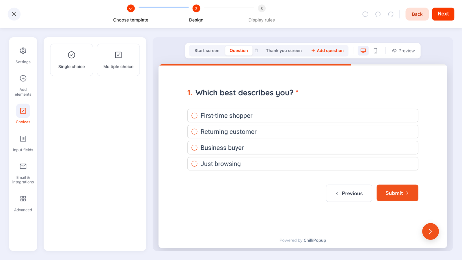
Options, not text fields: two taps costs almost no conversion and returns values you can route on.
The copy rules that are different for services
Ecommerce popup copy is built on urgency and price. Neither is available to you, and both are actively counterproductive on a site selling expertise.
| Do | Don't | Why |
|---|---|---|
| Name a specific deliverable | "Get in touch" | Concrete offers convert; open invitations do not |
| Promise a response time you keep | "We'll be in touch soon" | "Within two working days" is a commitment; "soon" is filler |
| Write as a named person where you can | "Our team of experts" | Clients hire people, and the anonymous version reads as a template |
| Show the work in the offer | "Subscribe to our newsletter" | Nobody's problem is a shortage of agency newsletters |
| Keep the tone of the site | Countdown timers and urgency | Fake scarcity on a considered purchase costs you credibility |
One popup an agency should never run: a spin wheel or scratch card. Prize games work beautifully in retail and read as unserious on a site asking somebody to trust you with a six-figure project. Format has to match the price of what you are selling.
How to qualify without scaring anybody
Qualification is where agencies lose the most leads, usually by asking for everything at once. The rules that keep it cheap:
- Two questions, both as options. Service and budget, or service and timeline. Tappable choices also return normalised values — 10–25k rather than "around 15 maybe?" — which is what makes routing possible at all.
- Ask about the project, never the person. Company size, job title and "how did you hear about us" can all be answered later or looked up.
- Put the email last. By then they have invested two taps and finishing is the path of least resistance.
- Give the escape hatch a real label. "Still scoping" tells you more than a forced number does.
- Never gate the case studies. Making an evaluator register to see your work is the fastest way to lose the evaluation.
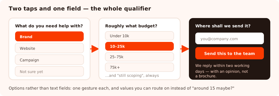
Two taps and one field. Everything else you need can wait for the call.
Turn your best pages into conversations
Popups, inline forms, qualifying quizzes and surveys from one editor and one script tag — and a workspace per client site if you need it. Free plan, no credit card required. Paid plans from $29/month.
Start free →The display rules, page by page
The rules matter more on an agency site than on a shop, because your traffic is smaller and every visitor is worth more. A recipe that works:
| Page | Trigger | Audience | Frequency |
|---|---|---|---|
| Blog posts | 55% scroll | Everyone | Once every 30 days |
| Case studies | 75% scroll | Everyone | Once per visitor |
| Services | Exit intent (desktop), 50% scroll (mobile) | Returning visitors | Once every few visits |
| Contact / pricing | Exit intent | Everyone | Once a day |
| Home page | Nothing | — | Leave it alone |
Three rules apply to all of them. Turn off show again after conversion, so somebody who has already enquired is never asked again. Set an explicit frequency, so a prospect reading four case studies in one sitting meets one popup rather than four. And never let two campaigns fire in the same session — the frequency guide covers how the cooldowns interact.
What to measure when volume is not the goal
An agency winning four projects a year will never have enough data for a confident A/B test, and pretending otherwise leads to decisions made on noise. Measure these instead:
- Qualified enquiries per month. The only number that matters. Define "qualified" before you start counting, or the definition will drift to flatter you.
- Conversion rate per page. Compare each popup against itself over time, never against the others — a case-study popup and a blog popup are asking different things of different people.
- The answer mix on your qualifier. If 80% of enquiries say "still scoping", your positioning is attracting people earlier than you want.
- The pages that produce good conversations. Submissions record the page they came from, so you can see which case study is actually generating work — and write more of that one.
One operational detail worth building a habit around: enquiries land in the dashboard, not in your inbox. On a site that gets four enquiries a month, "I'll check it when something comes in" is not a system — put a weekly look at the submissions table in someone's calendar, or you will find a three-week-old project brief the hard way.

Small numbers, read carefully, beat big numbers read in aggregate — especially when one enquiry is worth a quarter.
Running this for clients
If you build sites for other people, the same setup is a service you can sell. The dashboard is organised into workspaces with their own content and their own team members, so client work stays separated, and higher plans raise the number of domains and seats you can cover. Two practical notes:
- Install the script during the build, not afterwards. Retrofitting a tag into a finished site is a change request; including it from the start is a checkbox.
- Hand over the rules, not just the popup. A client who does not understand the frequency settings will eventually set everything to "every visit" and blame the tool.
Five things agencies get wrong
- A newsletter popup on every page. Nobody's problem is a shortage of agency newsletters.
- An eight-field enquiry form in a popup. That is a brief, and briefs belong on a page somebody chose to open.
- Gating the case studies. The work is the sales pitch. Do not put a form in front of it.
- Copying retail urgency. Countdown timers on a consultancy site read as a red flag, not a reason to hurry.
- Running five campaigns on a site with 900 visitors a month. You will learn nothing and annoy everybody. Two, well placed, is a strategy.
Related reading
Frequently asked questions
Do popups work on agency websites?
Yes, but not the ecommerce kind. An agency has no discount to give and no impulse purchase to trigger, so a popup earns its place by offering something a prospective client actually wants at that moment — a teardown, a checklist, a relevant case study, or a shorter route to a conversation. Judge them by enquiries, not by email volume.
What should an agency popup offer?
Something that demonstrates the work rather than describing it. A one-page audit checklist, a breakdown of a project like theirs, a pricing guide, or a fifteen-minute call with a named person. The test is whether the thing on offer would still be useful to someone who never hires you — if not, it is a brochure and it will convert like one.
Should I put a popup on my agency's case study pages?
It is the single best page to use one on. A visitor reading a case study is imagining the work applied to their own business, which is the shortest emotional distance to an enquiry you will ever get. Trigger it on scroll near the end and ask the obvious question: want this for your brand?
How do I qualify leads without losing them?
Ask two questions, both as tappable options rather than text fields — typically the service they need and a budget or timeline band. Two taps costs almost no conversion and lets you route the enquiry properly. Anything longer belongs on a page the prospect chose to open, not on a popup that interrupted them.
How many popups should an agency site run?
Two to four, each doing one job on one kind of page: something for blog readers, something for case-study readers, and something on the services or contact page. More than that and they start colliding with each other on the same visit, which reads as desperation on a site selling expertise.
What should an agency measure instead of signups?
Qualified enquiries per month, and the conversion rate of each popup on the page it lives on. An agency winning four good projects a year does not have the volume for statistical significance, so treat the numbers as a direction and pay attention to the qualitative pattern — which pages produce conversations you actually want.